case study
Industry: design

We are an
Asia-pacific brand creation
and design agency.
Fire traditional
petrol station branding!
case study
Industry: design
Get the gold!
case study
Industry: Events
Key visuals: A picture
with something to say.
case study
Industry: real estate
A name as big as
the names behind it.
case study
Industry: brokerage
Creating a branding solution
for Vietnam’s newest café.
case study
Industry: hospitality

We have offices in
Australia and Vietnam.
Fire traditional
petrol station branding!
case study
Industry: real estate
what we do
We are an Asia-pacific brand
creation and design agency.
Our work spans different fields and mediums, but all shares a common goal: to create something meaningful.
This is something we take great pride in. Collaborating
closely, we analyse
and
understand our client’s challenges,
and create solutions that are both effective and memorable — carefully calibrating every minute
detail of every minute aspect of our execution.
Hand-crafted brand identities shaped
to achieve strategic goals.
Purposeful, impactful messaging
targeted to specific audiences.
Upcoming creations visualised with evocative
CGI renderings.
Our favourite clients are the ones who love to innovate and push boundaries. People who are
driven by their passion, and who aspire to inspire their customers and
their
employees. We love
clients who challenge us to do more, applying our skills to new circumstances and novel environments.
Below are a few of the past clients and projects we enjoyed
the most.



























get in touch
We have offices in
Australia and Vietnam.

Level 54/111 Eagle Street
Brisbane CBD
Brisbane
Australia
P. : +61 418 505 978
E. info@soyon.art
166/34H Thich Quang Duc Street
Phu Nhuan District
Ho Chi Minh City
Vietnam
P. +84 28 6682 4206
E. info@soyon.art
case study
Industry: Brokerage
A name as big as
the names behind it.
SUMMARY OF PROJECT & CREATIVE CHALLENGE
Most new companies enter
the market from the bottom.
Bond enters from the top.
Bond is a newly established consulting firm, specialising in providing assistance to foreign investors who wish to enter the Vietnamese real estate sector.
Vietnam is rich in investment opportunity, but cultural difference and tightly interwoven business, political and legal environments make it impossible for outsiders to navigate the market without assistance. Influence and prestige play a far larger role here than most outsiders are accustomed to. In order to connect with someone influential, one needs the assistance of someone influential.
This is where Bond outstrips competitors. While Bond is newly established, the people who stand behind the consultancy are not. Each board member is an accomplished and influential person in their own right. Each a heavyweight in their respective fields. No other consultancy can boast anything near their level of reach and influence.
While competitors must rely on networks of intermediaries to connect with key suppliers, developers, officials, financiers, and other stakeholders, Bond is able to connect clients directly to them. This enables a full roster of services, from advisory to complete turnkey.
The newness of Bond to the market is at odds with how established the people who stand behind it are.
While new companies must generally enter into a market at the bottom, Bond enters from the top. Bond is already influential, it just remains for people to become aware of it.
The entire Bond brand identity, from the choice of name to the style of presentation of its staff, must reflect the confidence of an industry leader. Bold, masculine, and unapologetic.
Eschewing the refinement of western consultancies, Bond maintains a frontiersman-like quality. This market is full of potential, but yet raw. Bond is the brash and bold, action-oriented guide investors require.
BRAND IDENTITY
Impressions begin to form even before introductions have been made. Fine, tailored suits support Bond’s people in projecting an image of strength, self-assurance, and prestige.

In a market where clients, lacking insight and understanding, are filled with uncertainty, confidence stands above all. Bond is bold — even brash. This is reflected in the way Bond speaks and writes.
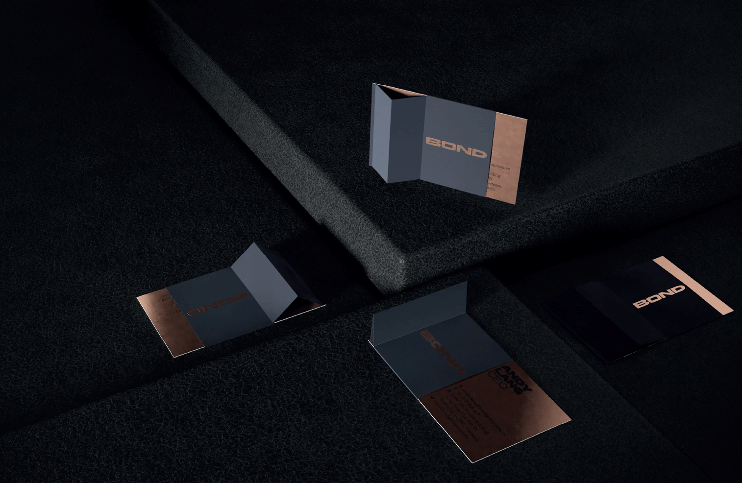
Strength needs no embellishment. For Bond, a simple wordmark logo is the perfect design option. Wide, with a bold typeface, the logo conveys power, sturdiness and confidence.
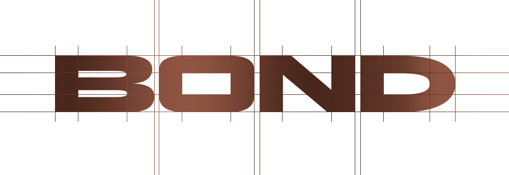
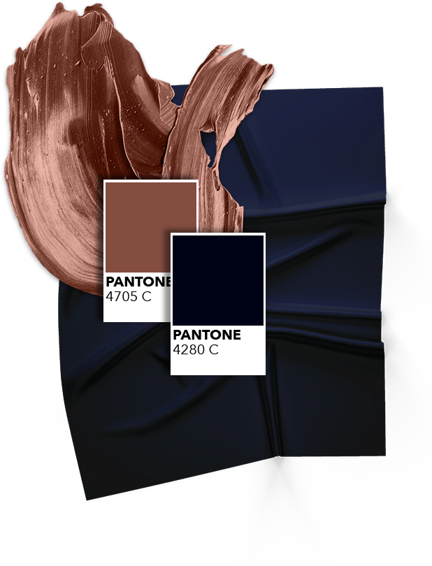
Bond needs to convey an image of being established, of being dominant, but also needs an image that’s distinctive and memorable. Combining the implacability of black and the sense of authority blue brings, a dark blue shade suits perfectly as Bond’s primary colour.
Playing the role of secondary colour, bronze is a good contrast to the dark primary. Metallic, bronze symbolises wealth, but does so without the ostentatiousness of gold or silver. Vietnam is an emerging market. Those who can navigate it have a little bit of a rough edge. Like bronze, they’re a little more rugged and unrefined.

For the headlines: Zeppelin
Highly legible, bold and free of any expression, Zeppelin embodies Bond’s all-business attitude. With its 32 different weights, this monolinear typeface is adaptable enough to suit any
space.
ABCDEFGHIJKLMNOPQRSTUVWSYZ
abcdefghijklmnopqrstuvwsyz
0123456789
!@#$%&/()=?
ABCDEFGHIJKLMNOPQRSTUVWSYZ
abcdefghijklmnopqrstuvwsyz
0123456789
!@#$%&/()=?
For the copy: Archer
Frank and practical, yet personable and attractive, Archer, a geometric slab serif typeface, hits all the right notes. Uncommonly versatile, it was designed specifically to suit not
only copy, but also charts, diagrams and tables. Together with the more direct Zeppelin, it forms a partnership that is both timeless and modern.
ABCDEFGHIJKLMNOPQRSTUVWSYZ
abcdefghijklmnopqrstuvwsyz
0123456789
!@#$%&/()=?
ABCDEFGHIJKLMNOPQRSTUVWSYZ
abcdefghijklmnopqrstuvwsyz
0123456789
!@#$%&/()=?
Bond is a name that makes an impression. Short, bold and straightforward, it’s easy to remember and easy to recognise. It’s a big name.
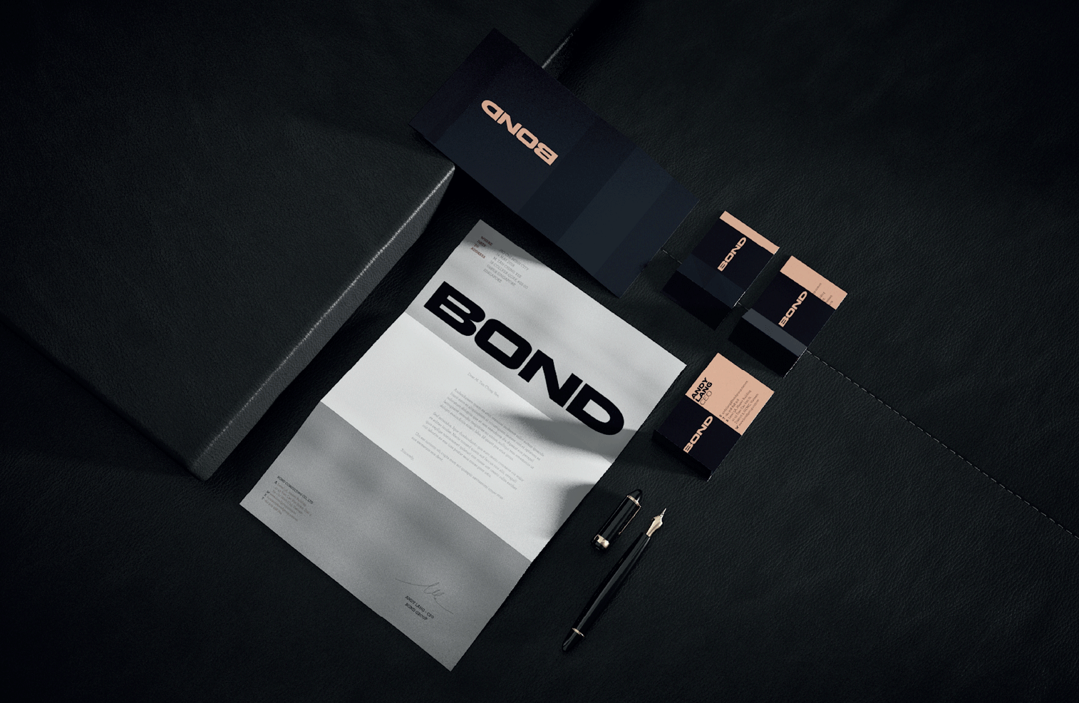
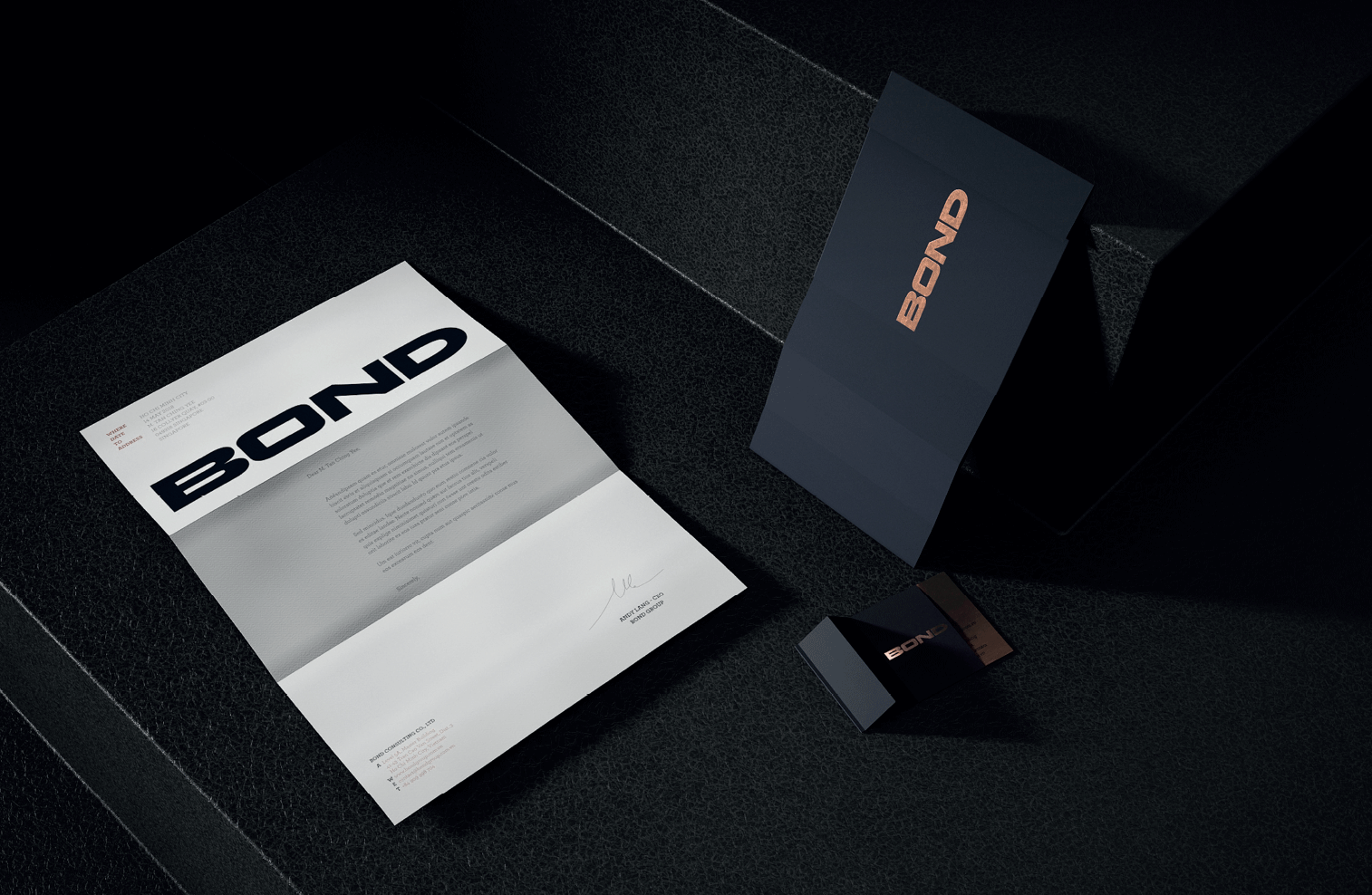
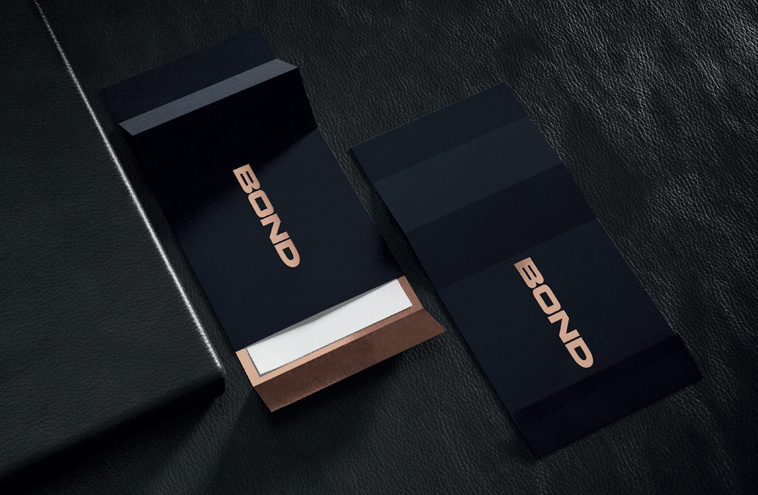
The true strength of Bond however is in the big names that lie behind it. It is this that sets Bond apart from competitors. Distinctive and memorable, Bond’s stationery stands as a prominent reminder of this inimitable quality.
case study
Industry: hostpitality
Creating a branding solution for
Vietnam’s newest café.
BACKGROUND & CREATIVE CHALLENGE
Baristo is a café start-up in Vietnam. Founded by an expat, a chef with roots in South Africa and Taiwan, then newly arrived in Vietnam, the café brand prides itself on its creative menu, and places an equal emphasis on food and drinks.
Starting with its pilot store in Ho Chi Minh City, Baristo aims to grow into a coffee shop chain spanning multiple locations and multiple countries. The café is intended to serve an urban audience, offering up a friendly and sociable atmosphere, and a focus on good health and sustainability.
Baristo needed an expansion-friendly branding solution, aimed at enabling the chain to make an impact and establish a foothold within Vietnam’s coffee shop sector, but also adaptable enough to meet the needs of future expansion into additional markets.
Conducting interviews and workshops, Soyon analysed and assessed the café’s core offering, brand intention and market environment, and worked with the client to develop the brand’s nomenclature, brand identity and positioning.
Thereafter, we were tasked with designing a robust and extensible visual identity, including strategy and design for the café brand’s logo, its store interiors, and photographs, and finally, the production of packaging, stationary, sales collateral, and a comprehensive logo guide.
ASSESSMENT & UNDERSTANDING
Pursuing innovation and ingenuity, Baristo sought to delight and engage customers by offering them new experiences and striking sights. Presentation and taste are given equal attention. Drinks and meals feature bold combinations of colour and texture, resulting in something that is as enjoyable to the eyes as it is to the taste buds. The ideal that the cafe strives for is that the drink or meal that you order should make your mouth water, creating anticipation, which then, when you eat it, turns to satisfaction.
A selection of tea and coffee-based drinks were included — creative re-imaginings of time-tested classics and wholly novel creations. Presenting strong imagery, the beverages are colourful, varied and attractively decorated. Meals consist primarily of bread-based options, with an array of toasted and untoasted sandwiches, bagels and buns. Several healthy options are also available.
Desserts are presented as an attractive add-on to the drinks, with a variety of combo options available. Some particularly striking dessert, drink and meal options are intended as time-limited promotion items. Table combo options, such as platters, and jugs or carafes for drinks, are considered in addition to other upselling ideas.
Mirroring the above, Baristo’s brand intention is to wow and engage customers with novel tastes and striking looks. The aim is to surprise, putting smiles on patrons’ faces. The café isn’t scared to try new things with the menu. It aims to push taste frontiers, introducing Vietnam to unique new creations and re-imaginings of beverages and cuisine from around the world.
Developing sociable, friendly, and welcoming environments, the brand wants to create an atmosphere that’s comfortable and inviting — the kind of place where people can feel at home, laughing and chatting with friends, while sharing a meal or a drink together.
Developing sociable, friendly, and welcoming environments, the brand wants to create an atmosphere that’s comfortable and inviting — the kind of place where people can feel at home, laughing and chatting with friends, while sharing a meal or a drink together.
Pursuing innovation and ingenuity, Baristo sought to delight and engage customers by offering them new experiences and striking sights. Presentation and taste are given equal attention. Drinks and meals feature bold combinations of colour and texture, resulting in something that is as enjoyable to the eyes as it is to the taste buds. The ideal that the cafe strives for is that the drink or meal that you order should make your mouth water, creating anticipation, which then, when you eat it, turns to satisfaction.
A selection of tea and coffee-based drinks were included — creative re-imaginings of time-tested classics and wholly novel creations. Presenting strong imagery, the beverages are colourful, varied and attractively decorated. Meals consist primarily of bread-based options, with an array of toasted and untoasted sandwiches, bagels and buns. Several healthy options are also available.
BRAND IDENTITY
We take educated young adults who look for enjoyment and satisfaction in their lives, and who care about themselves, their appearances, the lives they lead, and the world around them, away from their repetitive food routines by creating a brand that aims to wow the senses — delivering unexpected, interesting, striking, and delectable dishes and drinks, in an environment that engages and welcomes, fostering a sociable atmosphere.
The brand’s primary focal points are its dedication to creating wonder with the meals and beverages it offers, and the sociable atmospheres it fosters. Secondary factors serve a supporting role to the primary focal points, helping to orient the brand where there are opportunities to create further differentiation. These supporting focal points are the brand’s earnest and socially responsible outlook, and its commitment to encouraging good health.
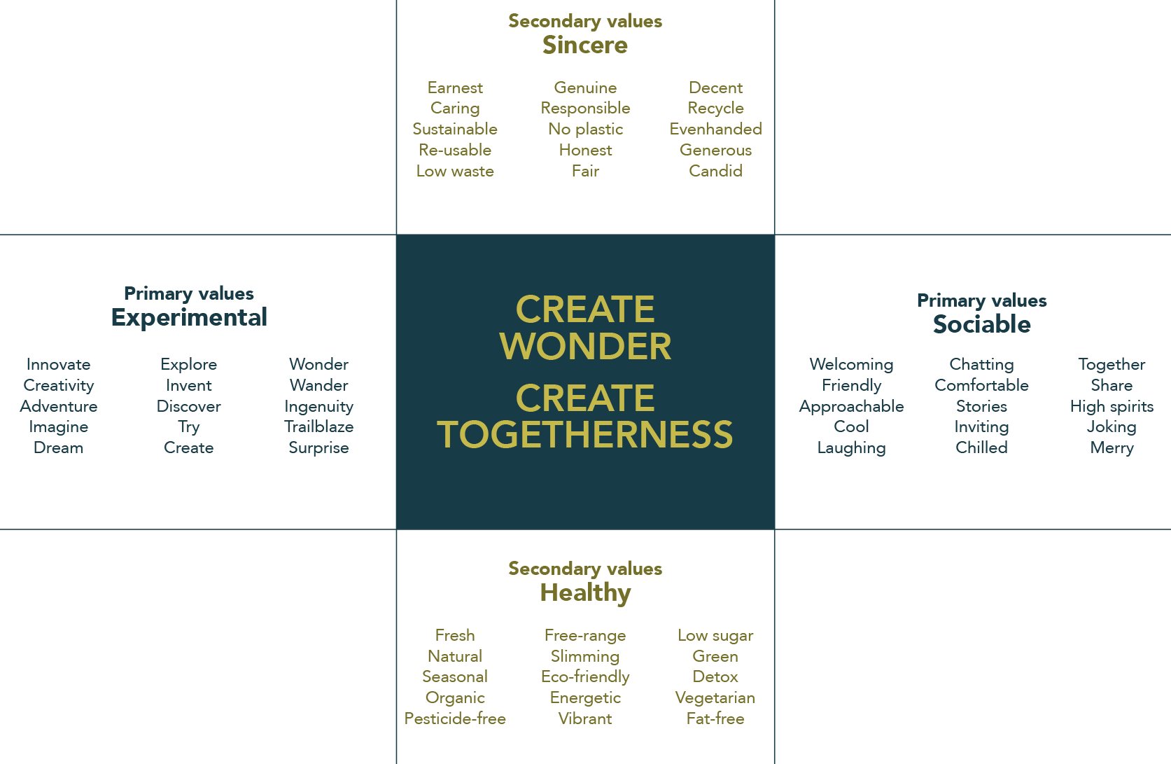
We engage with customers by bringing them out of their usual routines, and offer them striking dishes and drinks with new and unexpected flavours, in a welcoming, sociable environment.
A brand’s name is its first communication opportunity. It should reflect the brand pillars. A café brand that is about creating wonder and fostering sociability, suits a name that evokes
inventiveness, and amiability.
Identifying and shortlisting a selection of names, we analysed them according to three criteria.
Is the name easy to remember? Easy to communicate? Does it have the potential for sounding familiar?
Does the name reflect the brand pillars well? Does it support the brand’s personality and story?
Does the name separate the brand from competitors clearly and strongly?
| Memorability | Suitability | Differentiation | |
|---|---|---|---|
| 1st | Fresh | Lekker | Lekker |
| 2nd | Baristo | Baristo | Baristo |
| 3rd | Charlie's | Charlie's | Fresh |
| 4th | Lekker | Fusion | Fusion |
| 5th | Fusion | Fresh | Charlie's |
COMPETITOR ASSESSMENT

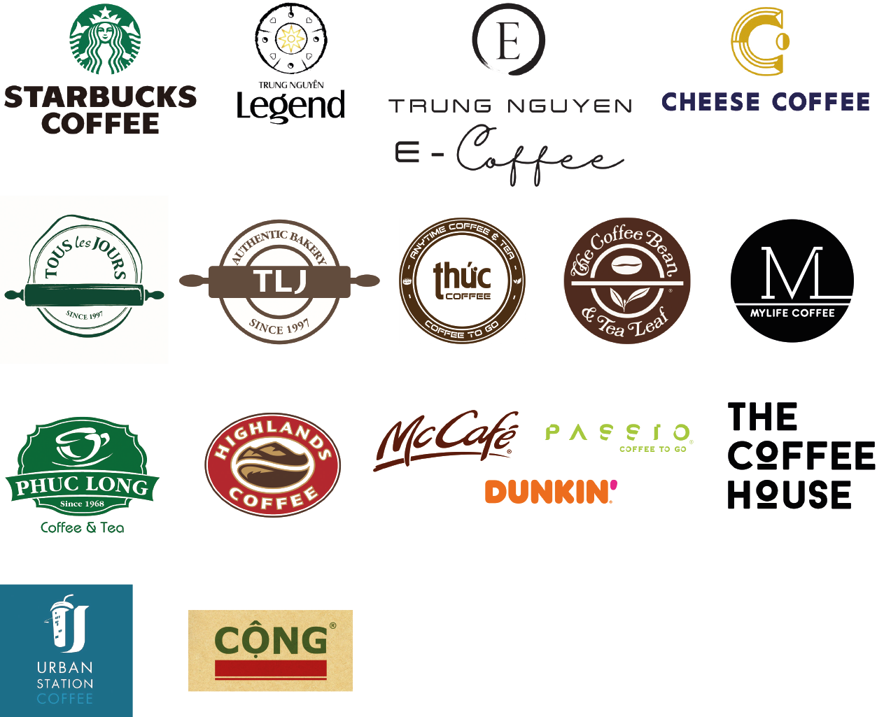
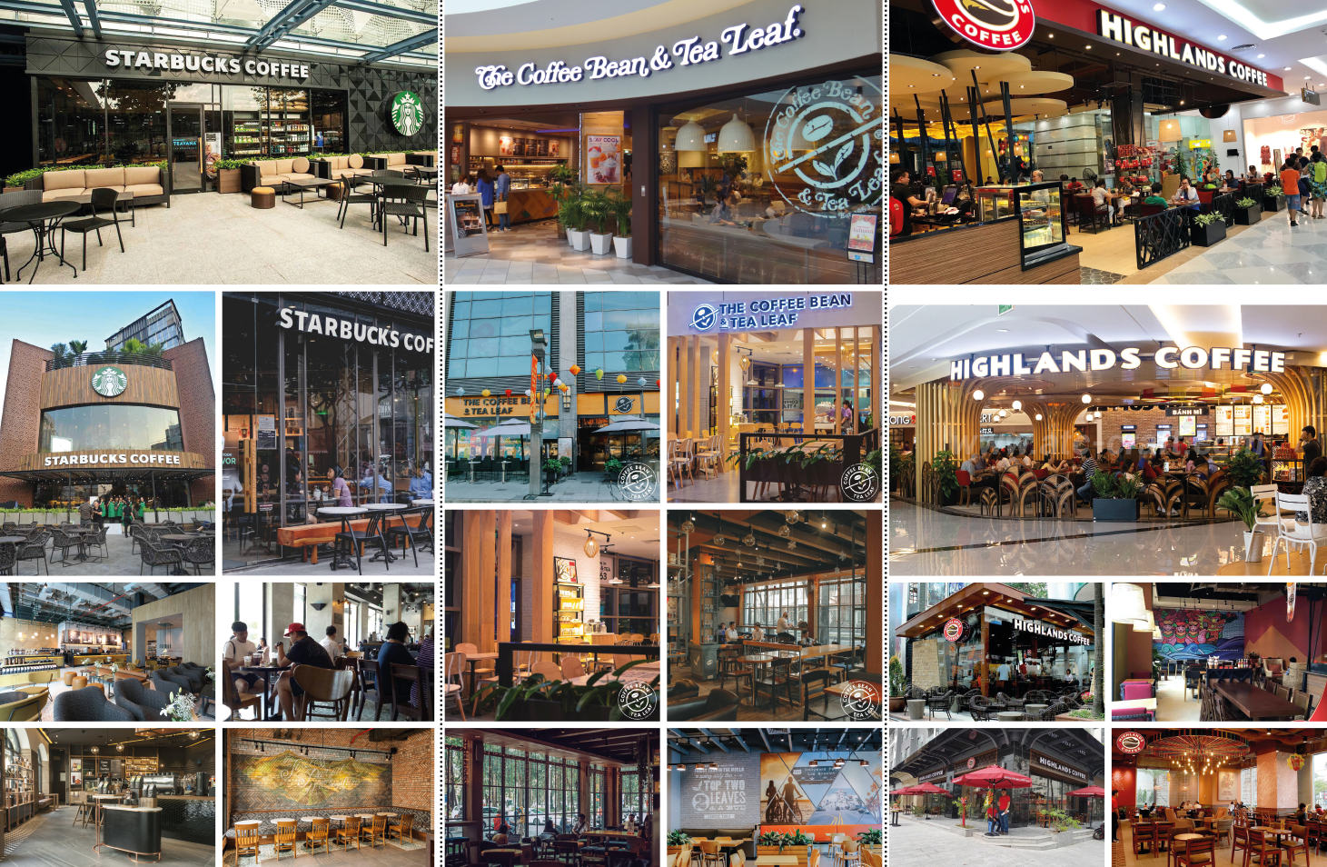
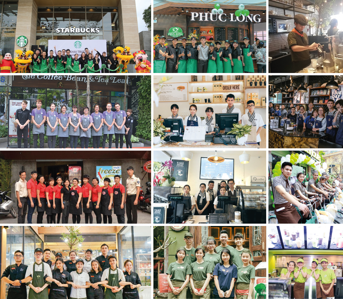
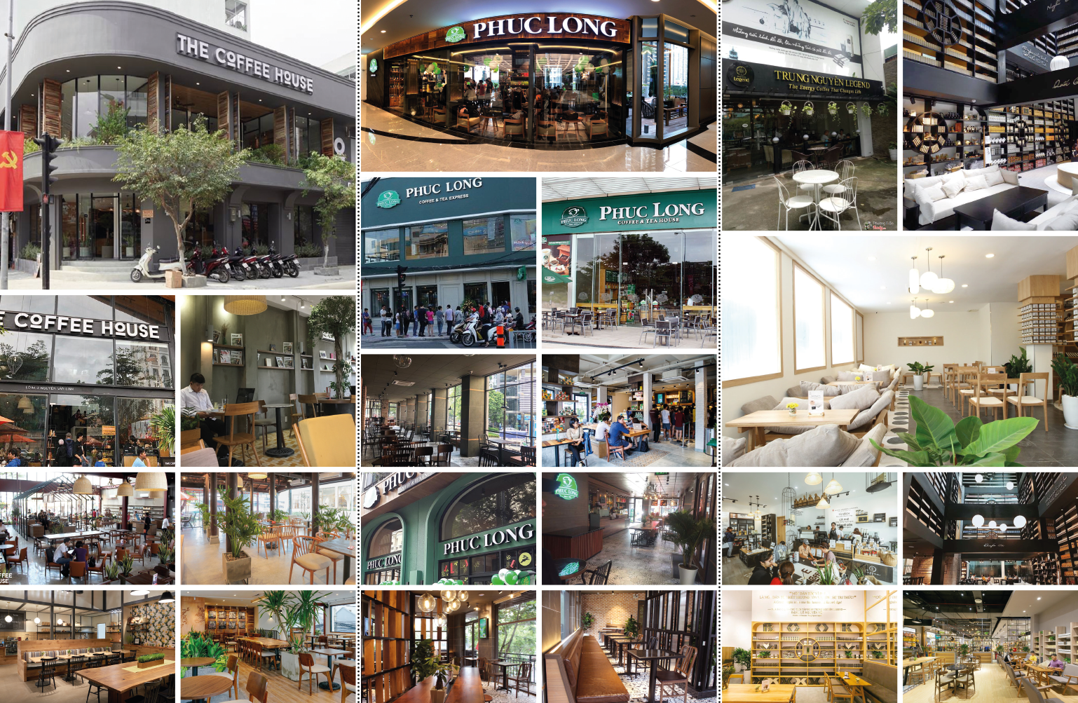
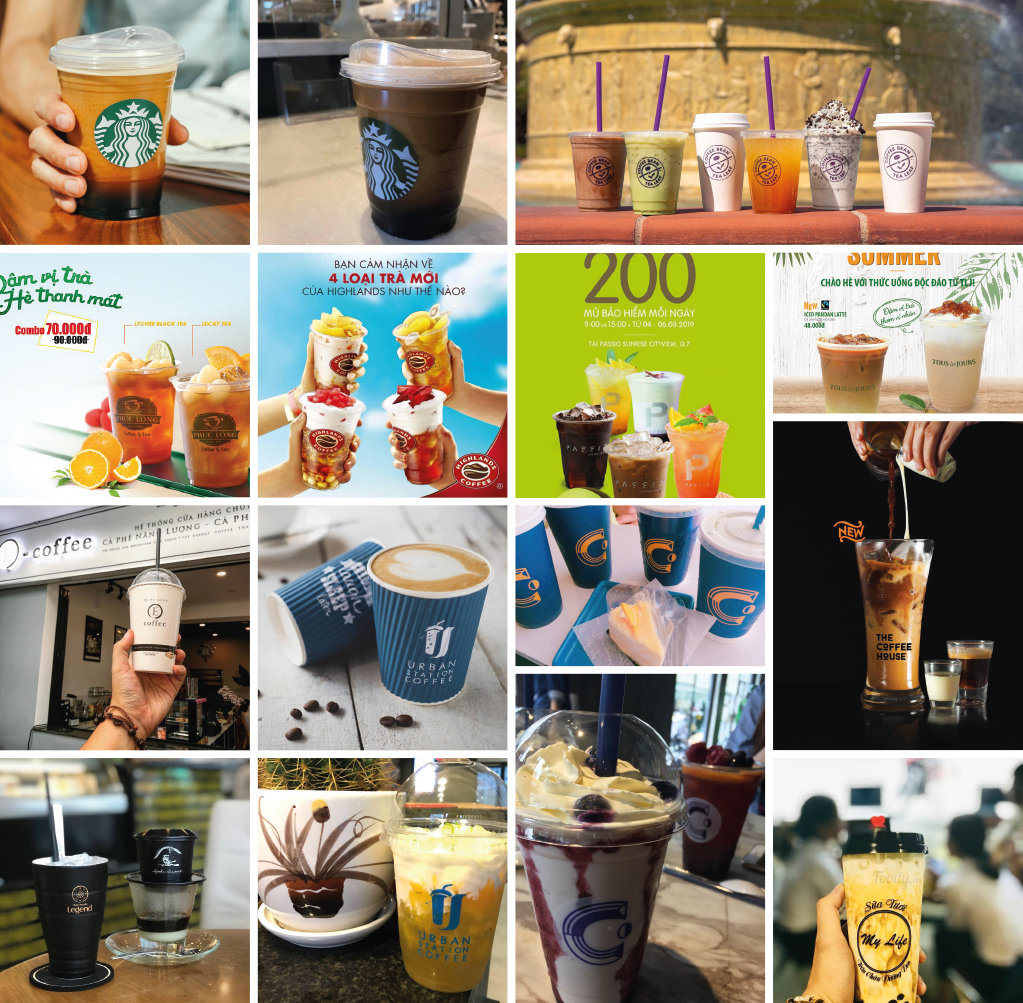
As with the logos, clear trends can be seen in competitors’ façades, interiors, and staff outfits. The signs on façades are all white on a darker background, and the architecture all comes from the same template. There is some individualised nuance in the interior design, but it all arises from the same set of long-established design codes. There’s nothing there one wouldn’t commonly expect from a coffee shop.
Many try to convey a feeling of naturalness through wood or roughness. Where there’s stylishness, it’s trendy, rather than modish or contemporary. There are also many forced artsy touches: the paintings, the quotes, the handwriting on menus, the corporate or marketing messages on the wall, the similar typography games — all the product of bygone, over-exploited design trends.
In the packaging too, much is the same. Limited R&D capabilities and the high cost of production likely contribute, causing most to settle for the same solutions for glasses and cups. The drinks themselves are also very similar. Each competitor has their own version of a range of fruity and creamy drinks, but there’s ultimately little to set their offerings apart.
In every sphere, conformity is strongly in evidence. These circumstances create an excellent opportunity for a new brand to differentiate itself by bringing something more distinctive.
logo
In order to be able to stand out as a brand, rather than as just a single café, Baristo needs to build a sustainable distinctiveness. Speed is also important. In this very competitive market, with numerous large and small players, with many established brands and coffee shops, it is essential to make an impression quickly. Like a snowball setting off an avalanche, the brand’s impact must be able to quickly grow.
In order to be able to stand out as a brand, rather than as just a single café, Baristo needs to build a sustainable distinctiveness. Speed is also important. In this very competitive market, with numerous large and small players, with many established brands and coffee shops, it is essential to make an impression quickly. Like a snowball setting off an avalanche, the brand’s impact must be able to quickly grow.
Moving against the flow of competitors’ visual identities, the question asked is, what would be an unexpected logo design style for a café brand named Baristo?
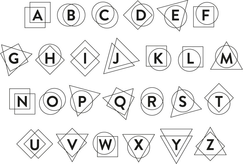
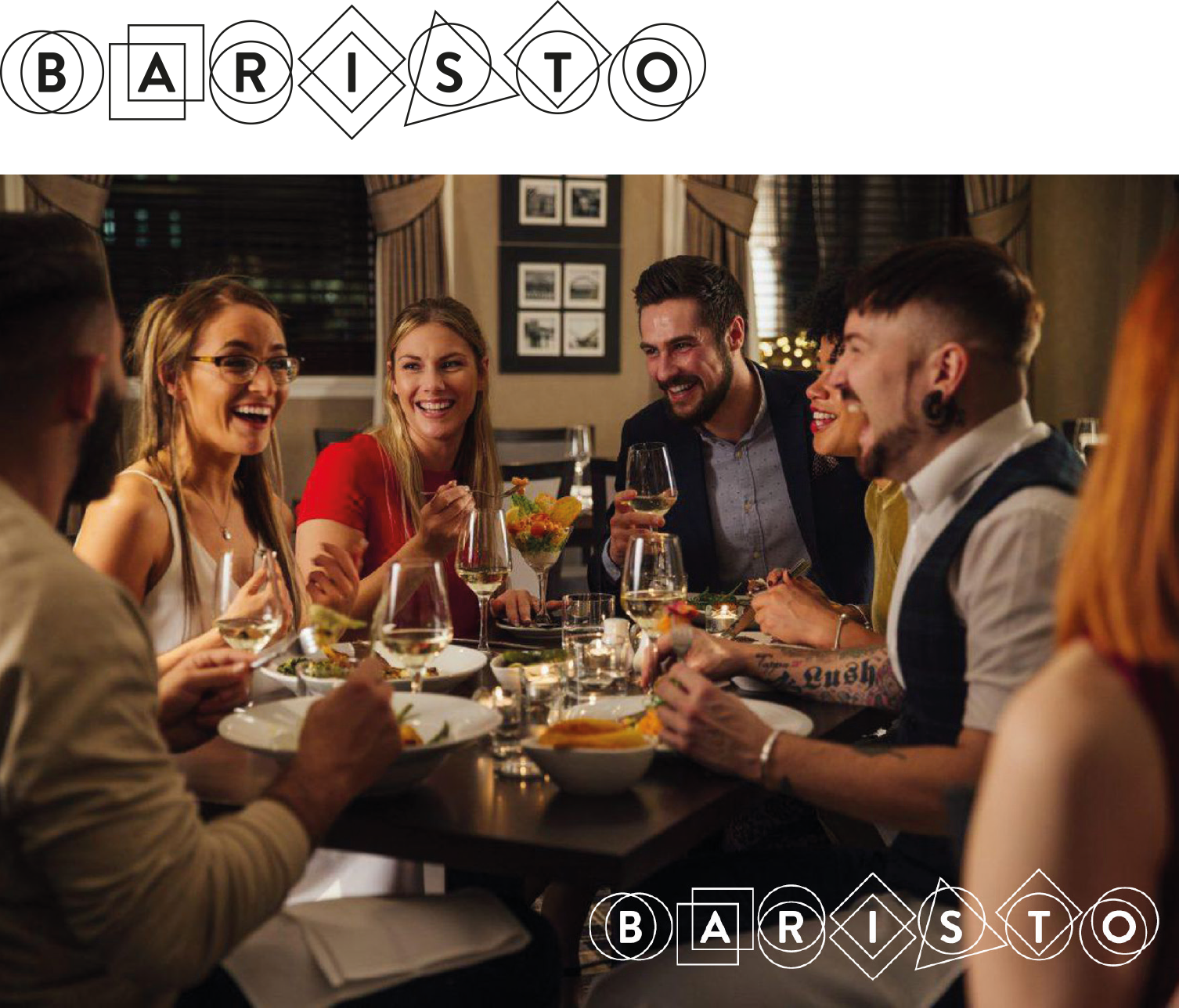
The Elements logo concept draws inspiration from the basic elements of taste: sweetness, savouriness, saltiness, sourness and bitterness.

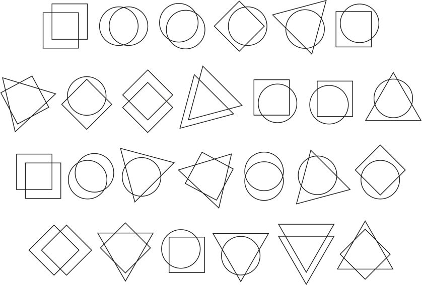
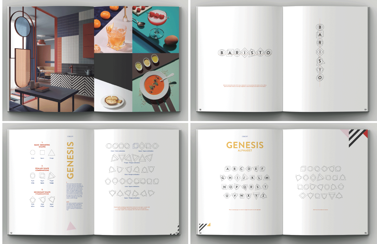
There are many icons that might potentially represent, symbolise, or otherwise convey the feeling Baristo embodies, but none could be adequate in effectively representing its depth. The logo for Baristo needs to be conceptual, not explanatory. If the wonders it creates are made of the basic elements of taste, then the logo will be made of the basic elements of design: the circle, the square, and the triangle.
The same way Baristo experiments with different taste combinations, we experiment with different combinations of the basic geometric shapes, leading us along toward a logo.
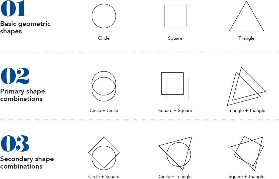
Exploring this combining of geometries further, we come upon a system with a lot of possibilities. It opens perspectives for the development of a unique, organic visual language, and a new style of communication.


interiors
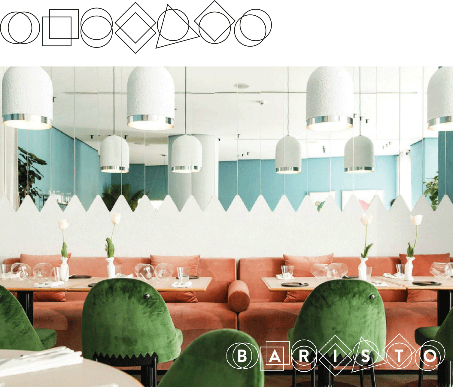
Baristo’s dual focuses are wonderful food and wonderful moments. These are what makes up the Baristo brand experience — the dishes the café creates and the interior environments customers are welcomed into. Other aspects, such as the logo, the menu, the name cards, and the visual identity developed through collaterals and other communication materials, are all there purely to help communicate what these two establish.
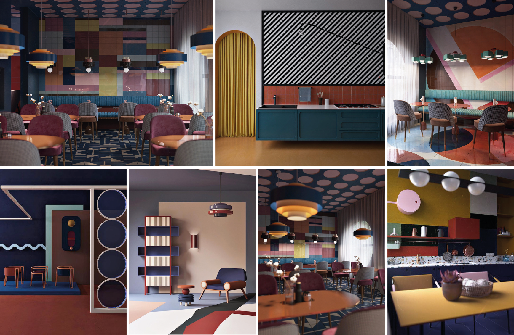
Building upon the foundation laid by the ‘Elements’ concept in the logo design, the interiors concept sought to go beyond simple visual style, and create a conceptual branding language. As with the logo, the interiors concept draws inspiration from the elements of taste, and in turn from the basic elements of graphic design. The visuals are an expression of simple elements coming together in different ways, resulting in the creation of spaces that are harmonious, inviting and surprising.
With the basic elements of design as starting point, the interiors concept finds additional inspiration in the geometric abstraction of the Suprematist and Constructivist art movements.
A language of shapes and colours.
photography
The Baristo photography style is an integral part of the brand’s visual identity, helping to develop and demonstrate its distinctiveness, setting it apart from competitors, and boosting brand awareness and perception. Extending and developing the ‘Elements’ and ‘Language of shapes and colours’ concepts chosen for the brand’s logo and interiors, the photography style forms part of a unified visual language.
It provides photographers with guidance in framing and lighting product and portrait photos, and in selecting the clothing styles, accessory styles, and posing of models and other subjects. In line with the concepts already created, the photography style emphasizes geometry and sharpness, expressing a minimalist style. Anything that would soften the imagery (blur, bokeh, etc.) is avoided. The brand being about ‘creating togetherness’, the portraits have to be inviting, warm, friendly.
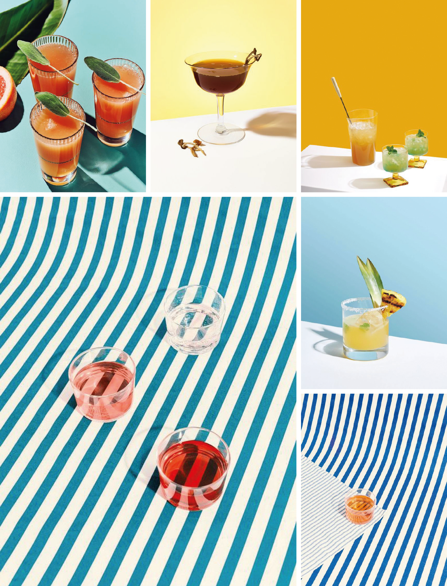
Baristo’s food and drinks are themselves composed of the basic taste elements that inspired the ‘Elements’ logo concept, and in turn gave rise to the ‘Language of shapes and colours’ interiors concept. Coming full circle, these concepts inform the product photography style. As before, inspiration is also drawn from the Suprematist and Constructivist art movements.
The fundamental aspect in photography is composition, which is achieved with line, shape, form, texture, pattern, colour and space. For the photography to support the brand visual ID concept and creative direction, those basic elements of composition should be in obvious evidence.
The food and the drinks are the main subject. With strong compositions, the photos must be built as in a painting: obvious geometric intentions and lines, clean shapes, sharp forms and volume, clear and strong shadows. Photographs should use open depth of field, with intended view lines, resulting in almost geometric-like photography.
More dynamic, this type of framing offers more opportunities than headshots and half-body shots. Can be single or two people (not recommended however, as it would be more challenging).
The models can be the centrepiece of the composition, or part of a set-up.
No perspective, no distortion, no bird’s-eye or low angle shots.
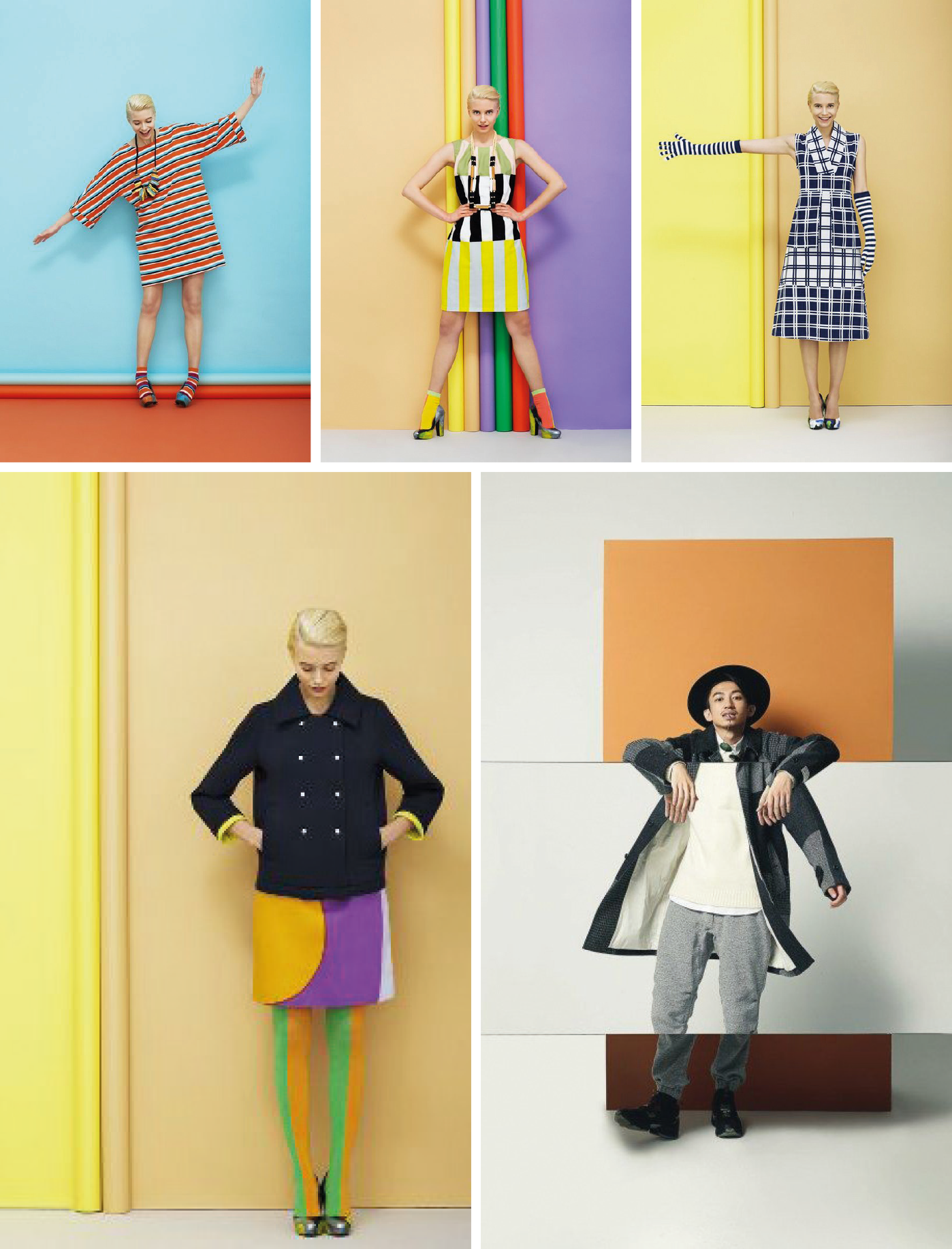
The clothing style must be in line with the brand personality/identity and should also connect with the target audience.
The clothing style must be in line with the brand personality/identity and should also connect with the target audience.
The colour palette should be in line with the one developed for the marketing/sales material and the interiors. The clothing colours will create harmonious contrasts with the background. Nothing pastel or bright/flashy and ‘in your face’.
Consider:
- Stripes.
- Printed or sewn, basic geometric shapes (square, circle or triangle).
- Patterns made of the basic geometric shapes (but the size of the shapes would have to be considered, the pattern shouldn’t look like a wallpaper).
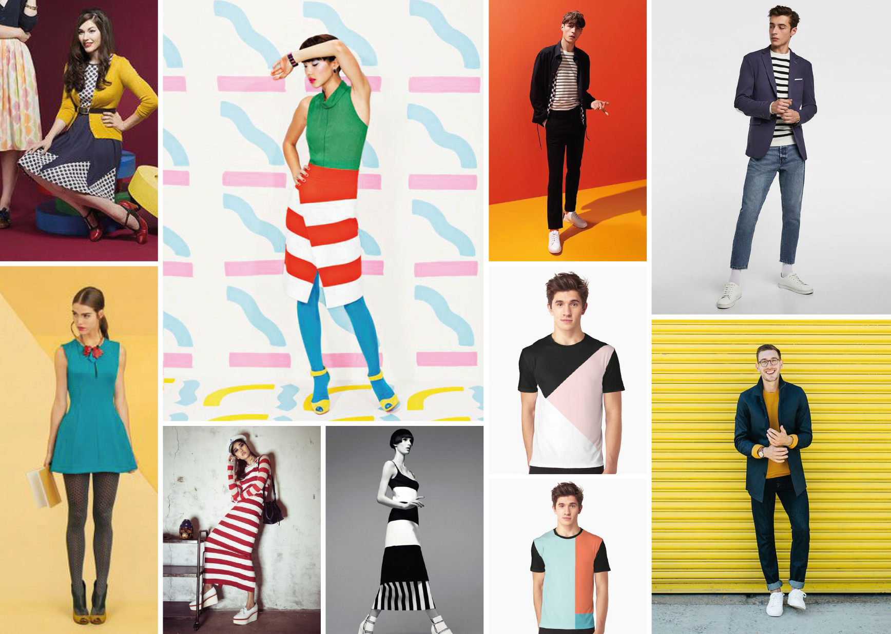
Baristo is about a love for food and enjoyable food moments. All of the images made for Baristo should send that message: the Baristo people love what they create, what they sell. In the portraits photos, the ‘models’ should interact with a meal or a drink.
Photographs should demonstrate some personality, reflecting individual character.

LOGO GUIDE & APPLICATIONS
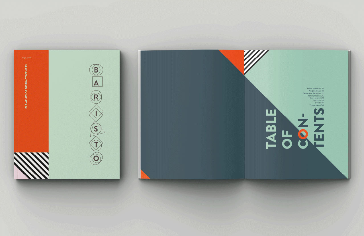
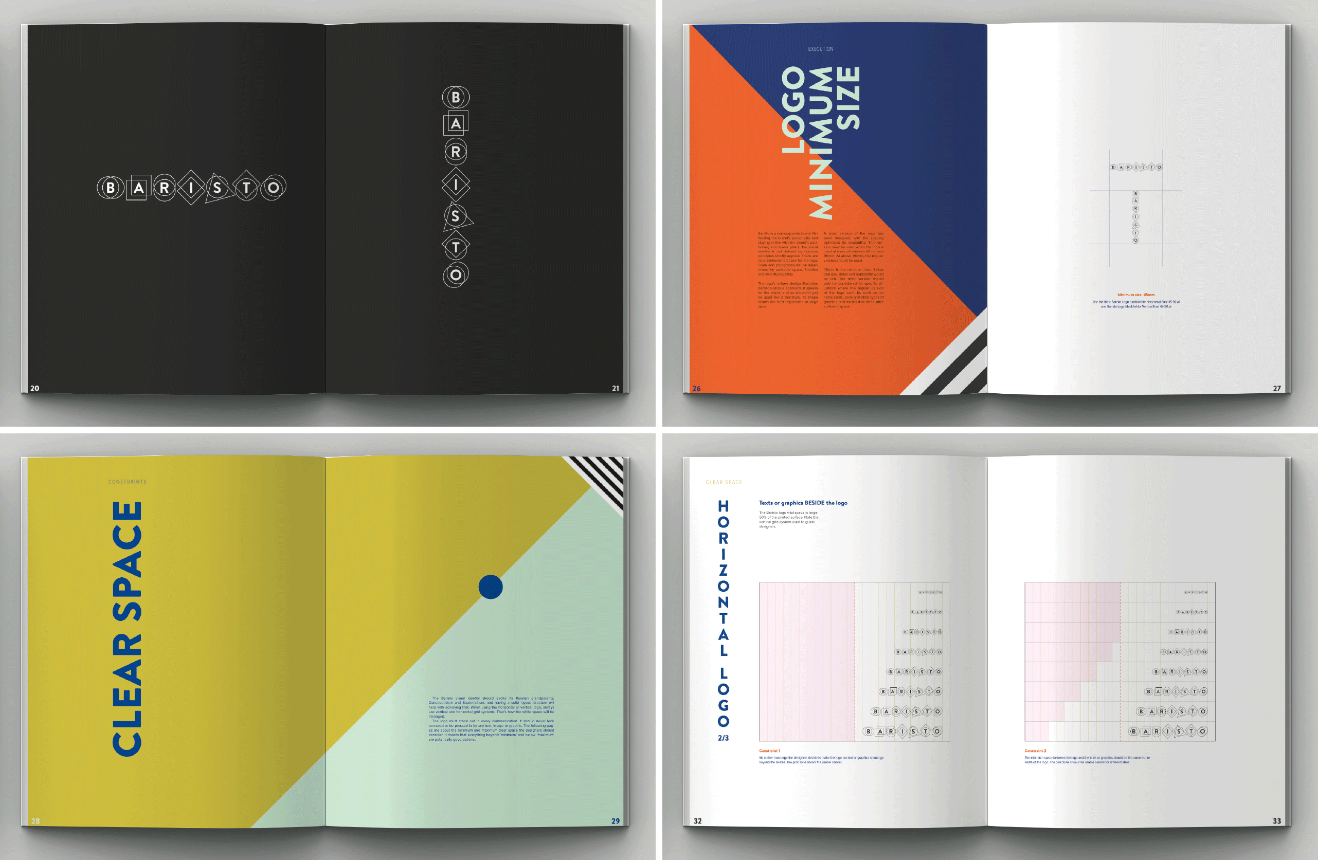
Logo guide
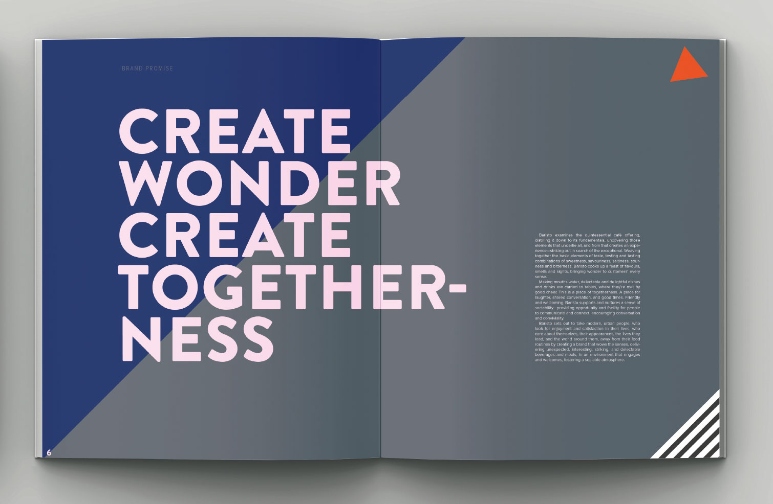
Baristo examines the quintessential café offering, distilling it down to its fundamentals, uncovering those elements that underlie all, and from that creates an experience — striking out in search of the exceptional. Weaving together the basic elements of taste, testing and tasting combinations of sweetness, savouriness, saltiness, sourness and bitterness, Baristo cooks up a feast of flavours, smells and sights, bringing wonder to customers’ every sense.
Making mouths water, delectable and delightful dishes and drinks are carried to tables, where they’re met by good cheer. This is a place of togetherness. A place for laughter, shared conversation, and good times. Friendly and welcoming, Baristo supports and nurtures a sense of sociability — providing opportunity and facility for people to communicate and connect, encouraging conversation and conviviality.
Baristo sets out to take modern, urban people, who look for enjoyment and satisfaction in their lives, who care about themselves, their appearances, the lives they lead, and the world around them, away from their food routines by creating a brand that wows the senses, delivering unexpected, interesting, striking, and delectable beverages and meals, in an environment that engages and welcomes, fostering a sociable atmosphere.
Baristo’s visual identity takes its cues from the kitchen. Here, armed with the freshest ingredients and the tools of their trade, our chefs work with the basic elements of taste, finding new expression in the limitless possibility this affords them. Just the same, we construct our visual brand identity from the basic elements of design — channelling the intentions enshrined in our brand pillars into the creation of an ID that’s engaging and impactful.
This focus on the fundamental, on basic elements, led us to the art movements of Suprematism and Constructivism. Taking inspiration from their geometric abstraction and clarity of purpose, we borrow from them some of their core elements, enlisting them in pursuit of our aims.
From Suprematism we take an ethos of design purity. It’s a design philosophy that uses elemental shape and colour to create form, communicating feeling and sensation, not through pictorial image, but with pure content and arrangement. It expresses, utilising only art’s barest essentials. As a communication tool, Suprematist design reaches out to the core of understanding, speaking volumes, while barely needing to say anything at all. It’s communication at its most direct, and most visceral.
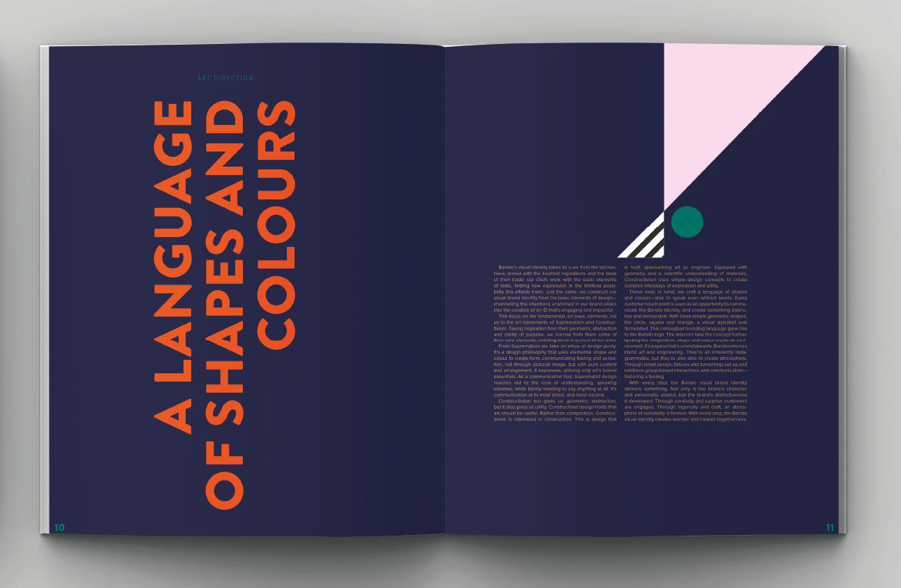
Constructivism too gives us geometric abstraction, but it also gives us utility. Constructivist design holds that art should be useful. Rather than composition, Constructivism is interested in construction. This is design that is built, approaching art as engineer. Equipped with geometry and a scientific understanding of materials, Constructivism uses simple design concepts to create complex interplays of expression and utility.
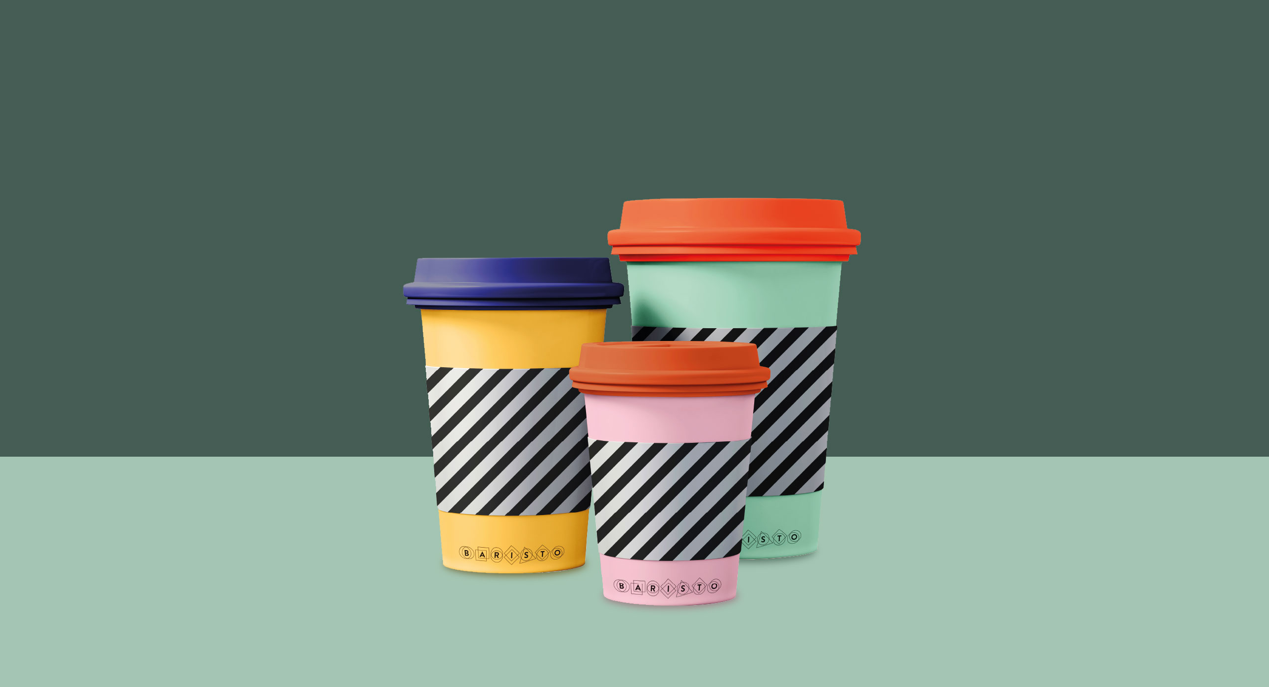
These tools in hand, we craft a language of shapes and colours — able to speak even without words. Every customer touch point is seen as an opportunity to communicate the Baristo identity, and create something distinctive and memorable. With three simple geometric shapes, the circle, square and triangle, a visual alphabet was formulated. This conceptual branding language gave rise to the Baristo logo. The interiors take the concept further. Igniting the imagination, shape and colour create an environment. It’s a space that’s unmistakeable. Baristo interiors blend art and engineering. They’re all inherently instagrammable, but they’re also able to create atmosphere. Through smart design, fixtures and furnishings set up and reinforce group-based interactions and communication — fostering a feeling.
With every step, the Baristo visual brand identity delivers something. Not only is the brand’s character and personality shared, but the brand’s distinctiveness is developed. Through creativity and surprise, customers are engaged. Through ingenuity and craft, an atmosphere of sociability is formed. With every step, the Baristo visual identity creates wonder and creates togetherness.
applications



case study
Industry: hostpitality
From storyes to stories
Background and understanding
After three years of use, the existing Lumi
Tropicana messaging and visuals have
become stale. Repackage the sales narrative
in anticipation of the
launch of the project’s
fourth and final tower.
After breaking away from its former parent company in 2015, Malaysian property developer, Thriven Global Berhad, then called Mulpha Land, adopted a new name and corporate vision. With a focus on lifestyles, the company pursues overlooked opportunities in the Malaysian real estate sector. Thriven’s strategy centres on two primary category brands: Enesta Homes is a provider of affordable housing, while Lumi Collections addresses the affordable luxury segment.
The Thriven name was not yet established, and so corporate trust and perception was closely tied to that of the company’s major flagship, Lumi Tropicana. It’s therefore beneficial to communicate synergy between the corporate philosophy and the project ideals.
Lumi is a provider of full-service residences. It’s a lifestyle brand that aims to redefine quality living within its sector by developing residences, services and environments that add value and make a meaningful impact on the lives of customers. The name Lumi is derived from the Latin word for “light”. This is also reflected in the brand slogan: Luminous Living.
“Luminous Living” functions well as a catchphrase and as a focus point for the brand intention, but it could create a lot more value if expanded into an aspirational philosophy. This is able to drive decisions and guide design.
After breaking away from its former parent company in 2015, Malaysian property developer, Thriven Global Berhad, then called Mulpha Land, adopted a new name and corporate vision. With a focus on lifestyles, the company pursues overlooked opportunities in the Malaysian real estate sector. Thriven’s strategy centres on two primary category brands: Enesta Homes is a provider of affordable housing, while Lumi Collections addresses the affordable luxury segment.
The Thriven name was not yet established, and so corporate trust and perception was closely tied to that of the company’s major flagship, Lumi Tropicana. It’s therefore beneficial to communicate synergy between the corporate philosophy and the project ideals.
Creative challenge
To achieve all of the developer’s
goals with the Lumi Tropicana
project, a distinctive impression
needed to be made, making it
possible to:
Clarify and build up the category brand’s sense of purpose, philosophy and approach.
Align the project brand’s positioning with the category brand’s positioning.
Repackage the Lumi Tropicana visual ID and messaging to better reflect the brand’s lifestyle focus, and create sales material able to create a fresh impact ahead of the launch of its final tower.
Produce a hardback volume that connects the corporate, category and project philosophies to create a brand legacy that extends beyond the marketing campaign and generates long-term value for Thriven and its future projects.
Creative challenge #1
Lumi is billed as a provider of luxuriant lifestyles for the active and aspirant. With the Lumi category brand, Thriven sees itself as tailoring holistic, but yet affordable real estate and lifestyle offerings for an audience who have high expectations and who desire a balanced and well-rounded private and professional life. They call this Luminous Living.
A home is far more than just a place to sleep. It’s a place to live. The centre of life for you and your family. The hub around which everything else turns. It grants you a set of opportunities, but also imposes limitations. It determines the type of life you’re able to lead. You buy a home, but what you’re really getting is a lifestyle.
It’s this principle that underlies each and every Lumi development. Lumi builds from the inside out. We design solutions to the lifestyle needs of our customers first, and design our buildings second. Every offering is tailored. To the concrete heart of the bustling city we bring a gorgeous, green oasis. To the quiet and leafy suburbs, we bring the energy of the city centre. To the desert we bring a lake.
Construction is only the beginning however. To truly realise lifestyle innovation, integration is essential. This is why Thriven not only develops, but manages all Lumi Collections residences as well. It’s this commitment to service quality that gave rise to Lumi’s signature full-service, hotel-style hospitality service. It’s this that informs Lumi’s careful curation of retail and service providers, and which drives the harmonious way in which home is blended with location, amenity, shopping, service, work, and play.
Lumi is convenience, Lumi is luxury, and Lumi is also affordable. With a love for striking architecture, original thinking, and inspiring design, Lumi brings balance to every area. Developing spaces that encourage healthy minds and healthy bodies, that foster a sense of community, and that impress and inspire, the lifestyles Lumi unlocks brim with vibrancy, energy and light. Lumi brings colour, shades and tones. Lumi injects life.
Lumi injects life into city neighbourhoods by first identifying the area’s energy and ambience, and then developing a project that introduces the opposite ambience — resulting in well-rounded, vibrant lifestyle offerings. Supporting this are three brand pillars. Arising from the vision, values and philosophy that underpin the Lumi brand itself, each brings a key element.
The first pillar, balance, reflects the Lumi dedication to bringing something new to neighbourhoods. The second, energy, represents the vibrancy and inspiration Lumi strives to deliver. And finally, there’s light, the third pillar, which stands for the way Lumi executes its strategies. With Lumi itself meaning light, the brand communicates itself by making creative and striking use of light to highlight and showcase.

Lumi injects life into the […] area,
which is known for its […] ambience,
by developing a project that
offers the opposite, an atmosphere
that’s […]
Creative challenge #2
Introducing Lumi Tropicana to the Lumi project positioning statement template, the strengths and opportunities presented by the project are illuminated. In this way the most impactful focal points for communicating the project are easily identified.
Lumi injects life into the [Tropicana] area,
which is known for its
[restive and idyllic, but daytime-only]
ambience,
by developing a project
that offers the opposite, an atmosphere that’s
[urban, stimulating, varied and ‘round-the-clock].
Creative challenge #3
To achieve a strong, unified and clear
message, the elements of the different
brand identities should each support
one
another. Text, imagery and visual
identity join
together harmoniously to
deliver just the right feeling.
With Lumi’s plain colours and the strategy behind its approach to date, an unengaging corporate feeling is created. It’s ill-suited for a luxury lifestyle brand like Lumi, and a poor fit for Thriven’s intended target audience. This extant visual identity had however been applied for several years, and so it would have been a poor decision to do a complete overhaul and allow all existing brand recognition to go to waste. The intention was therefore to modify and enhance the existing visual elements of the brand, injecting life, and introducing light.
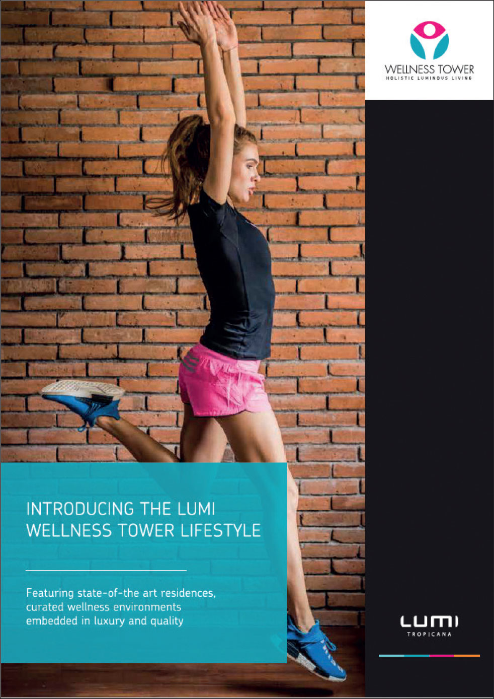
Light is central to the Lumi brand identity. It creates moods and tones. It highlights, showcases, and unveils. Applied in both the imagery and the visual style, by employing the creative use of light, we were able to entirely transform the way Lumi communicates. With vibrant colour, gradients and foils, the energy and dynamism of the brand was unveiled.
Drawing attention with character and personality, highlighting the uniqueness of
the Lumi Tropicana offering, the Lumi campaign went with a non-conventional
approach, connecting
with an
audience who want more than ordinary.
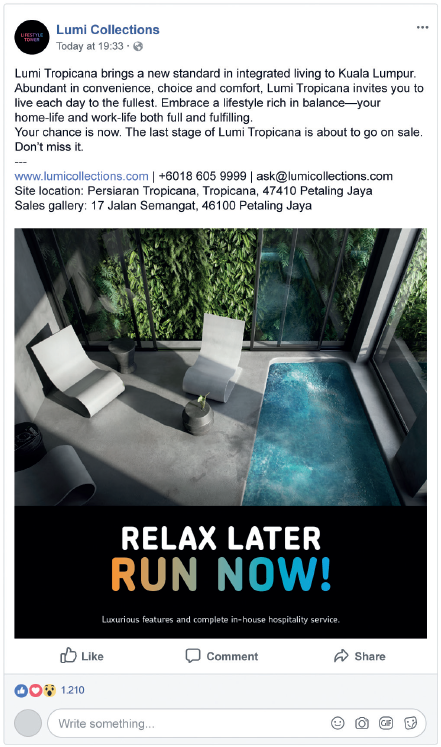
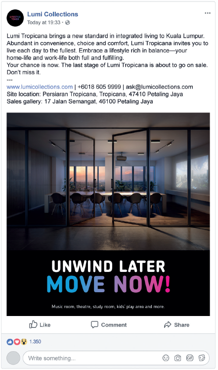
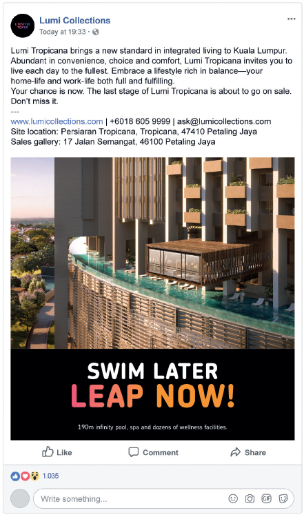
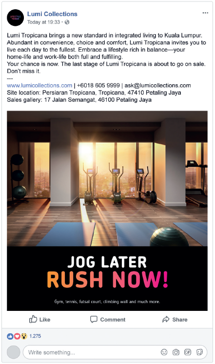
Tightly integrating text and imagery, the hoarding showcased the residence’s
features while simultaneously communicating the tone and feeling Lumi
embodies and unveiling the type
of lifestyle Luminous Living is able to unlock.
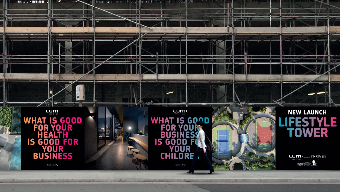
Lumi is an unconventional, bold brand, positioned in the affordable luxury
segment. Communicating it effectively requires an innovative approach that
can set its sales material
apart from the conventional and ordinary — without
forgetting cost effectiveness.
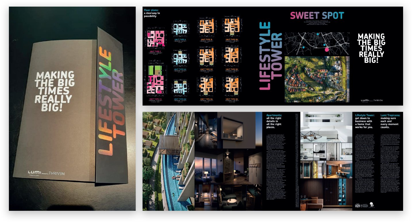
Creative challenge #4
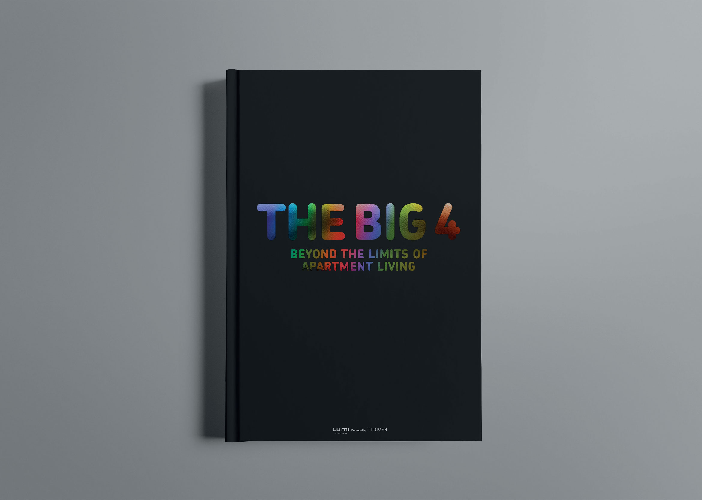
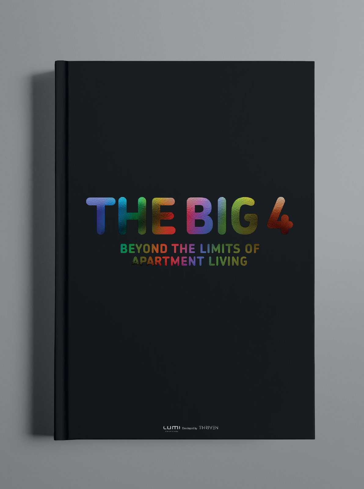
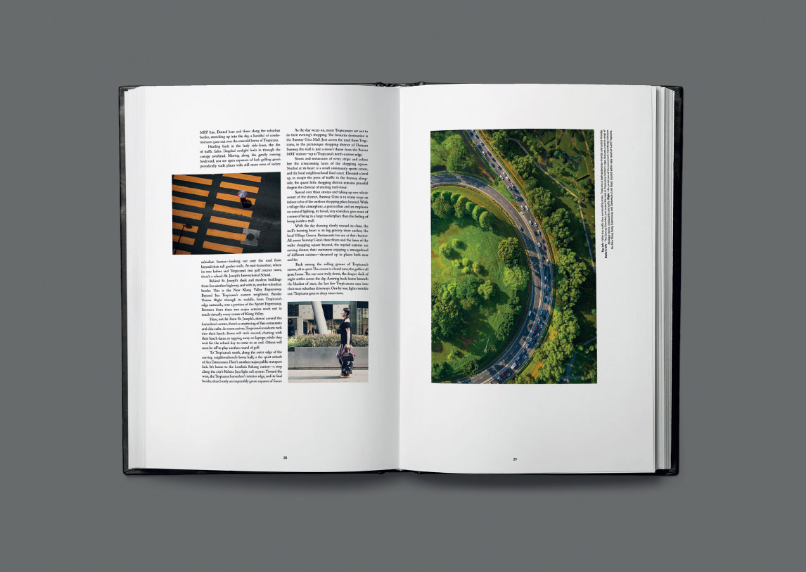
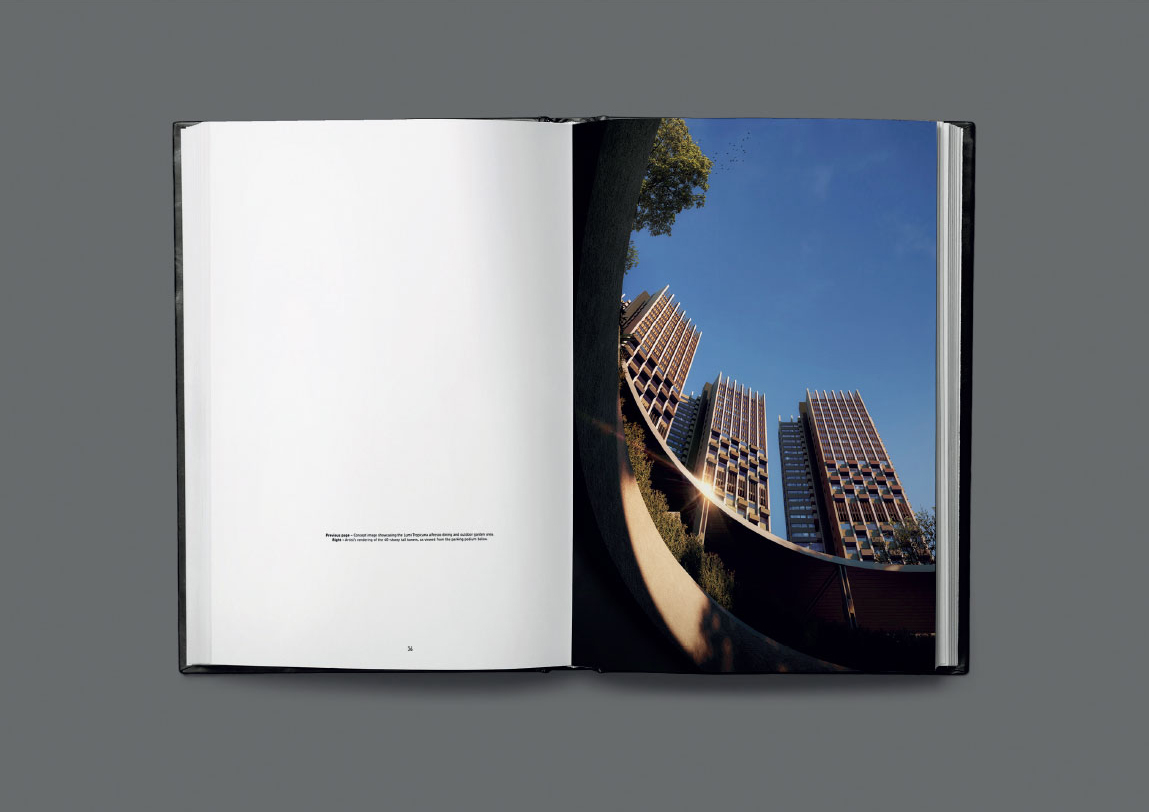
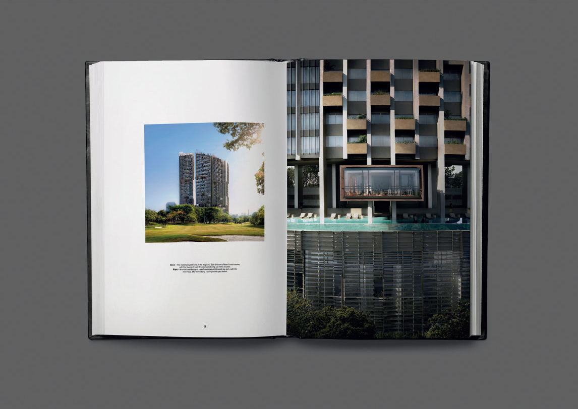
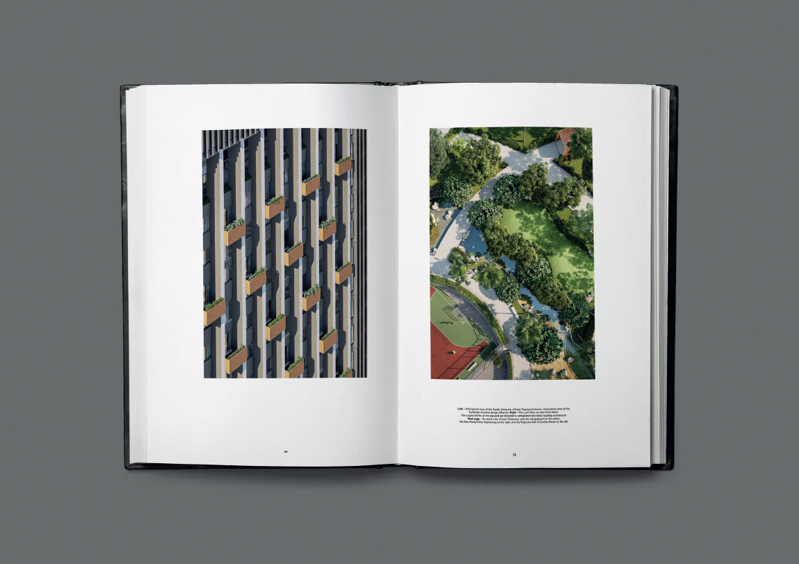
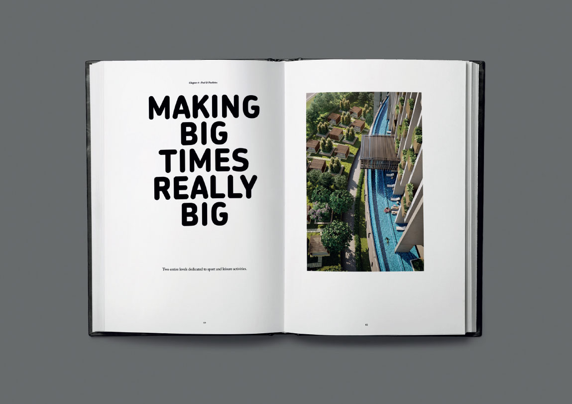
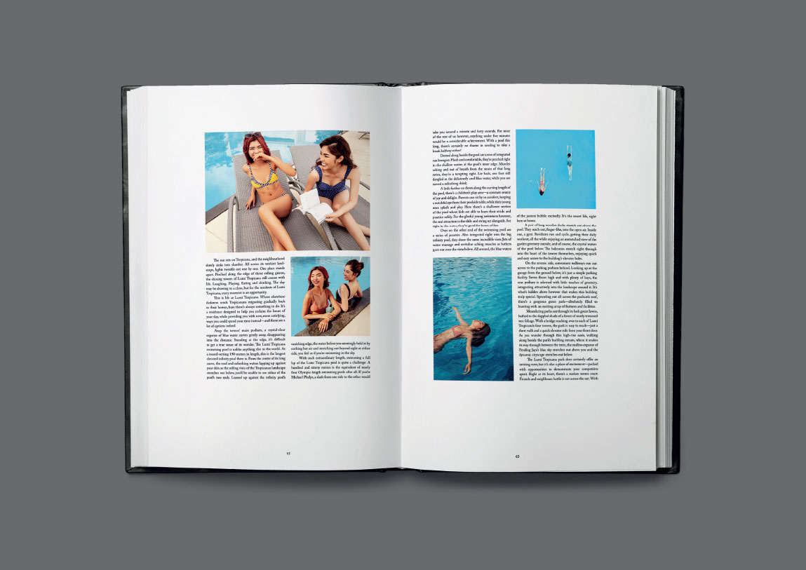
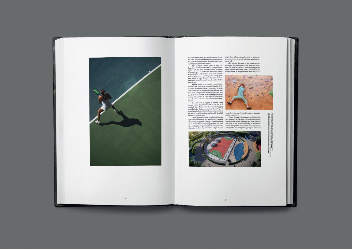
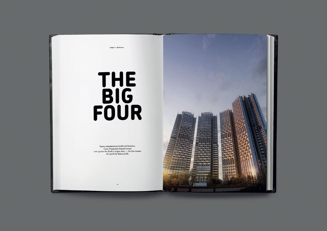
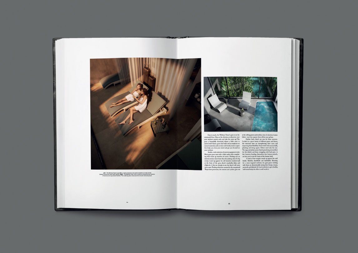
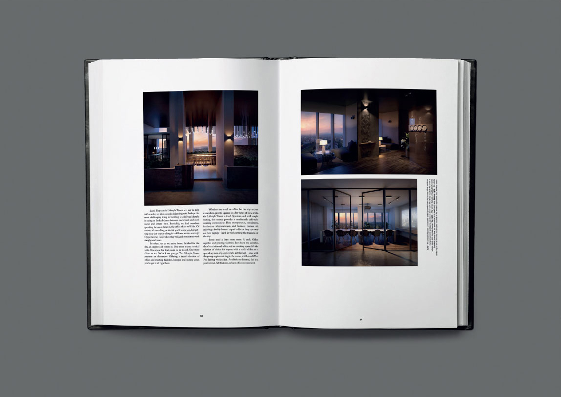
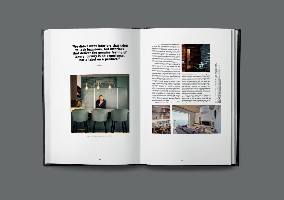
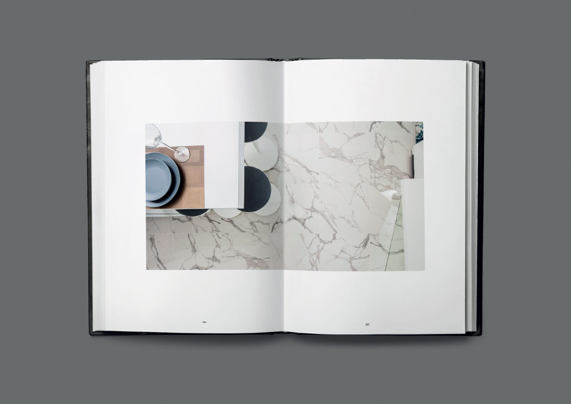
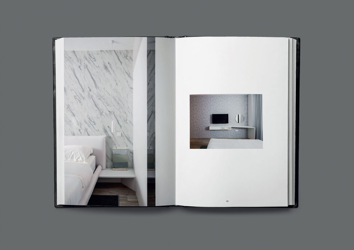
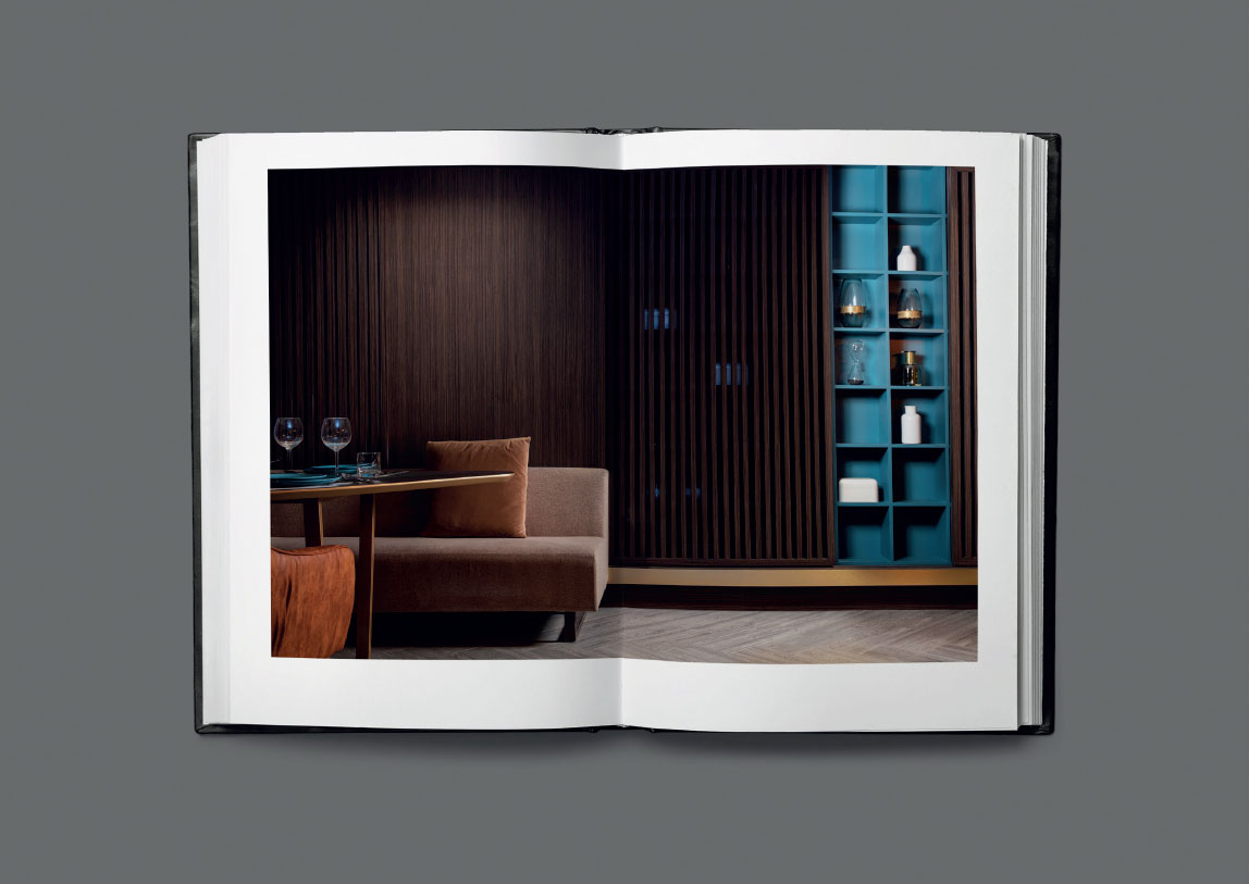
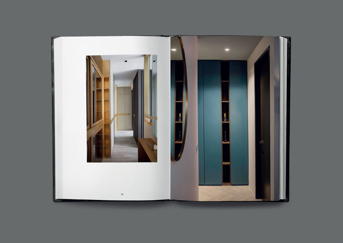
Weaving together developer, category and project, the Lumi Tropicana book showcases not only the project features, but also shares the ethos and philosophy of the developer and category.
Books are synonymous with storytelling. They share knowledge. Document a legacy. Where magazines and brochures tend to feel transient and disposable, books feel durable. They speak of quality and longevity. A coffee table-style book provided an opportunity to tell the Lumi story in full, producing something concrete and long-lasting, something able to stand as testament to Thriven’s vision, well into the future.
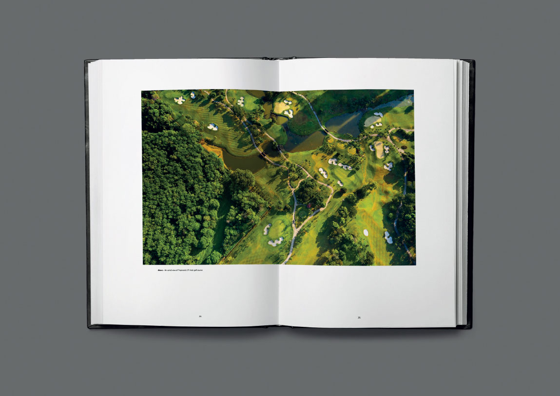
Large books are weighty and complex. Many different elements are interwoven, coming together to produce the whole, and as such, every aspect is itself a custom job. Aerial photography, CGIs, photoshoots with models, casting, styling, design, and of course telling the story. Everything is bespoke, made especially for the project.
Putting it all together, Soyon looked to perfection. Drawing on age-old, well-studied techniques, the Lumi Tropicana book employs an ideal ratio of width and height, using a grid layout methodology that derives from centuries of study and experimentation. Adapting these techniques to a modern world, considering contemporary audience habits and production processes, Soyon strove to produce something that could be a visual embodiment of the balanced life espoused within the Lumi story.
case study
Industry: petroleum
Fire traditional
petrol station branding!
Summary of project & creative challenge
Engineer an energetic brand
to overtake a tired industry
LMH set out to open ten branded retail petrol stations in Vietnam, with a view to opening another 100+ in the near future. Gaining market share in Vietnam’s highly competitive petrol station industry is a major challenge. Of the 14,000+ stations countrywide, over 90% are owned by just four state-owned enterprises: Petrolimex, Petrovietnam, Saigon Petro and Thanh Le.
In addition to these, several others maintain significant regional market presences, including also many major multinational petrochemical companies, such as BP, Shell, and ExxonMobil.
How can a newcomer achieve market penetration in a market like this? Traditional market penetration strategies can’t work in a government-protected industry. Retail fuel prices are largely centrally controlled and fuel quality is uniform. The typical characteristic of the petroleum distribution sector is that enterprises with large networks of retail points win the greatest market share, because customers tend to buy petrol at stations most nearby and convenient to them.
With bureaucratic support, state-owned competitors have already been able to snap up sites in the most trafficked locations, expanding rapidly. Petrol stations are abundant, present on every major road. This challenge is surmountable for the large multinational petrochemical corporations, who enjoy global brand awareness, and have access to extensive financial resources.
For newcomers however, getting noticed is a far greater problem. A more novel approach will be required.
Assessment
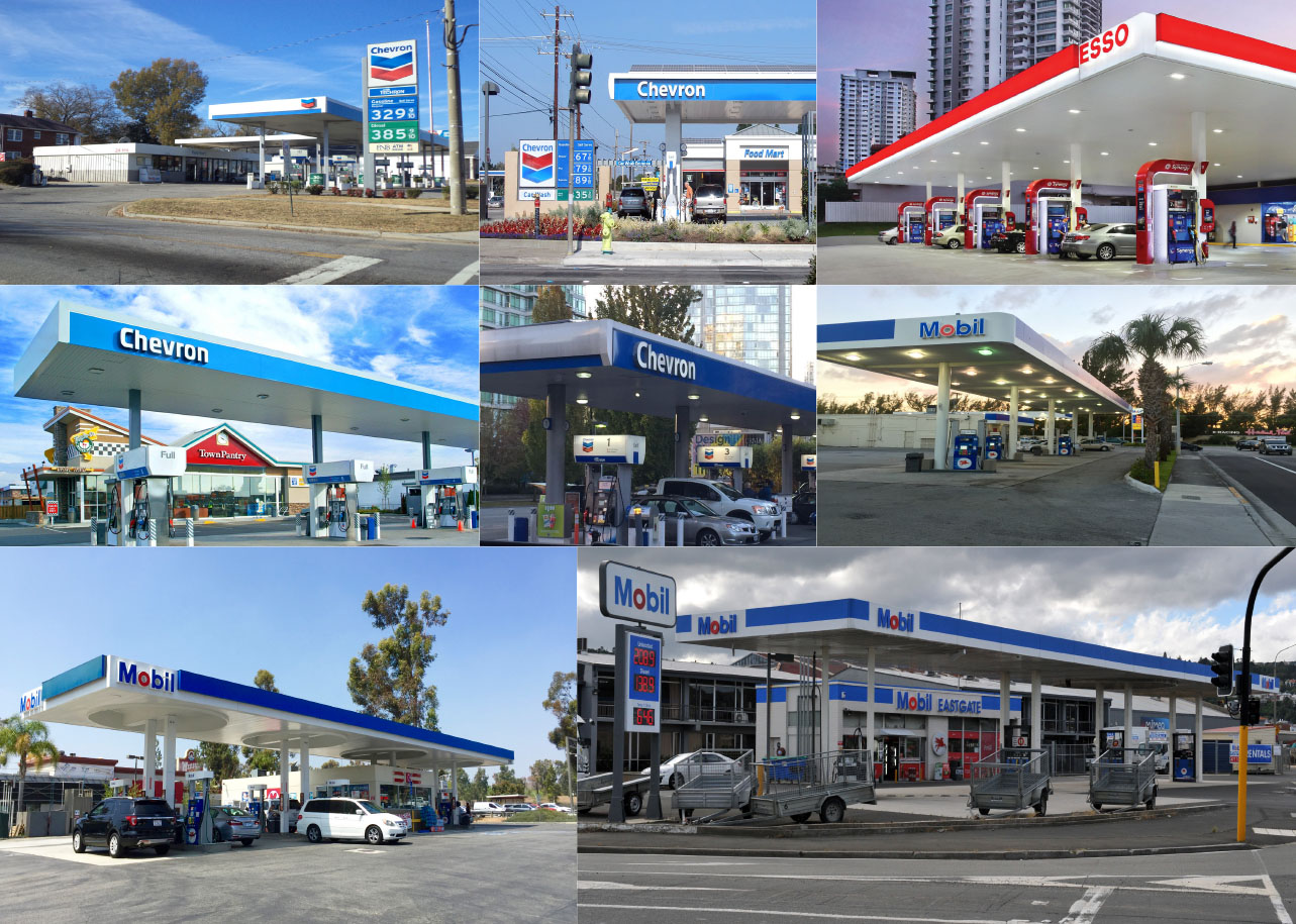
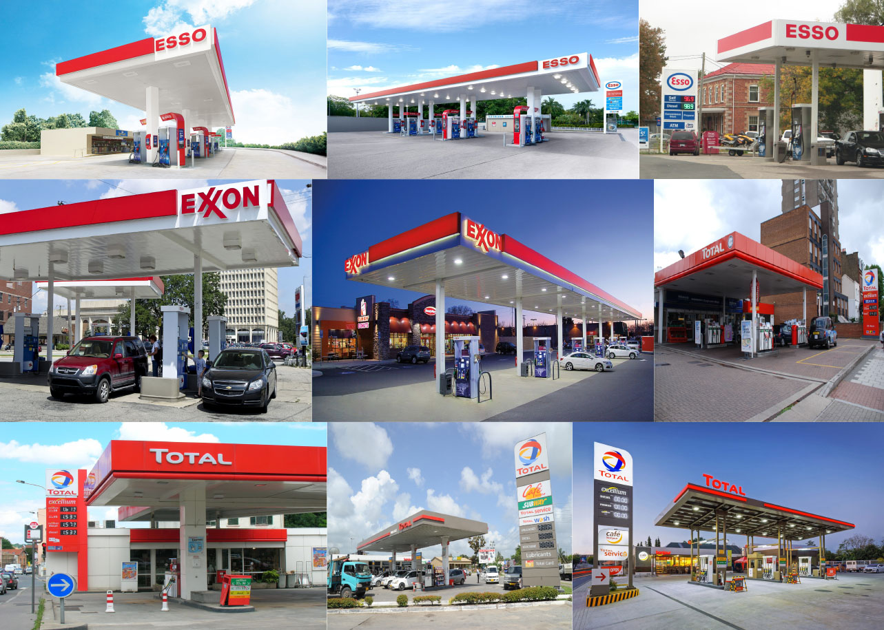
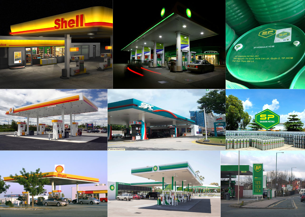
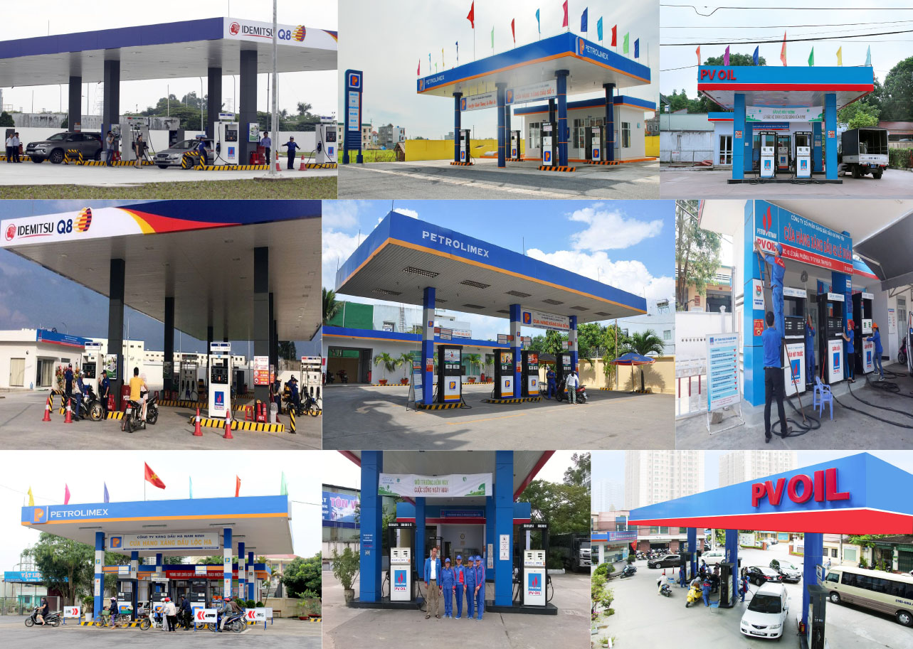
The petrol station industry is strongly conformist. As with petrol price and fuel quality, the approach brands in the petrol industry take with style is highly uniform — though here there is a choice. All use the same limited combinations of two or three primary and secondary colours. Logos are for the most part functional, with industrial styling. Their visual identities follow a set of design cues already decades old.







logo concept
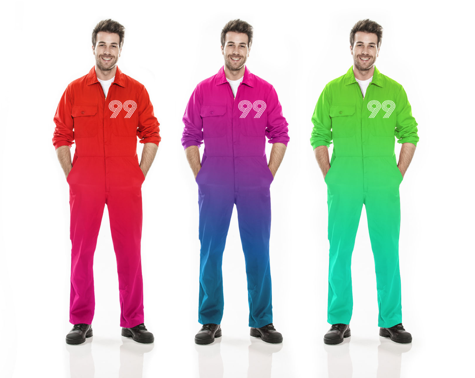
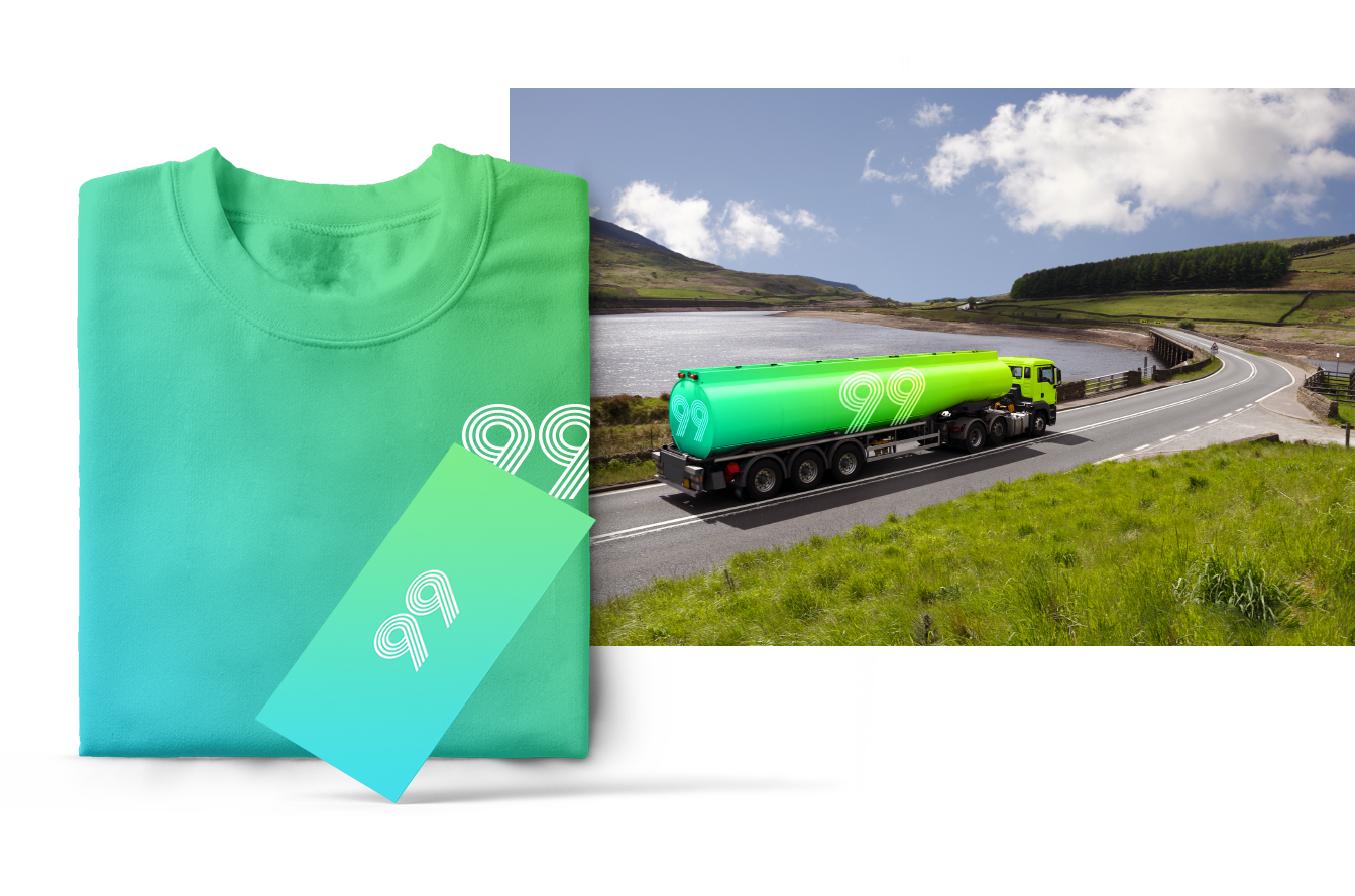
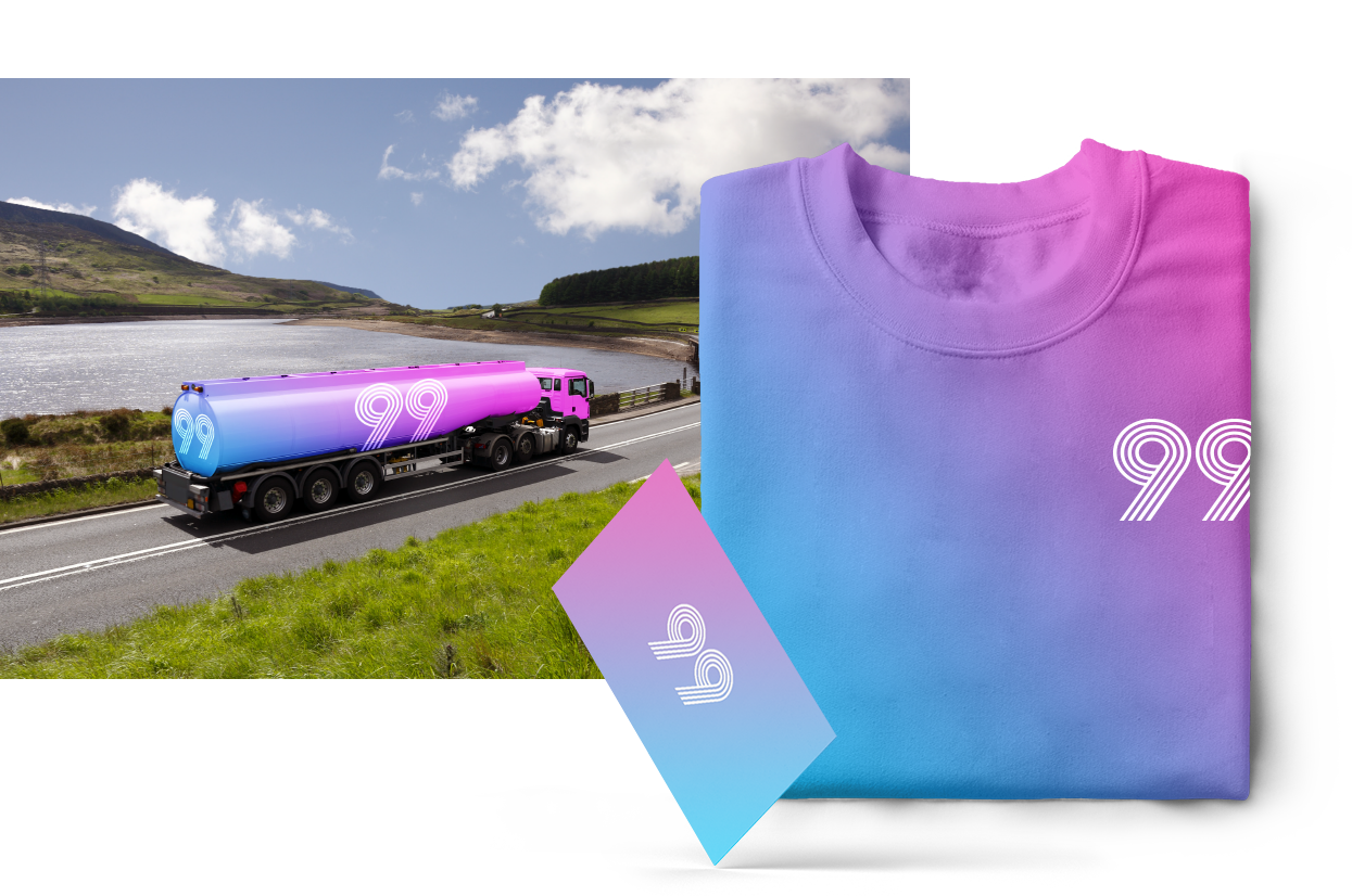
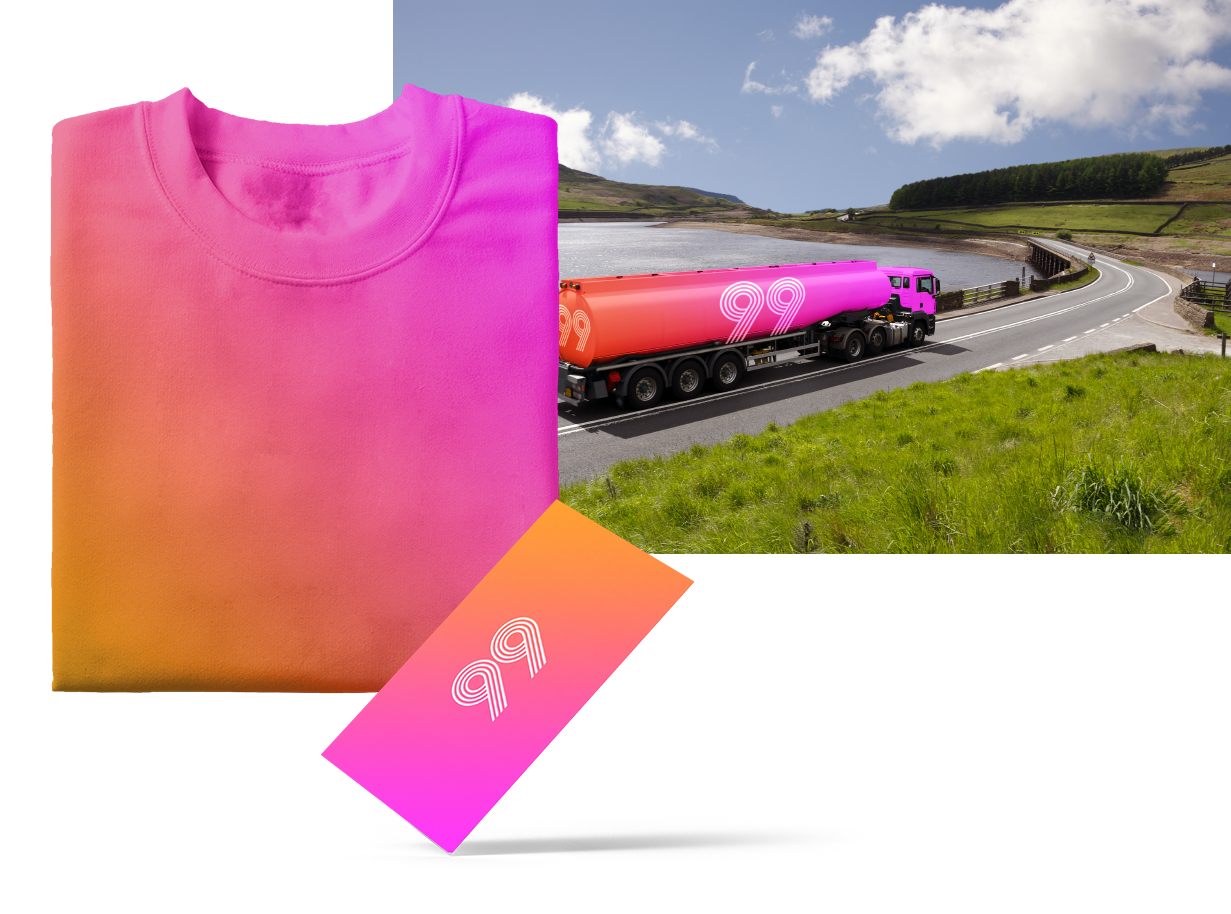
99 is a new kind of petrol brand. Highly distinctive, it presents a visual brand identity that breaks the codes of the entire petrol industry. It’s an opportunity to demand attention, cutting through the clutter, and quickly building brand awareness.
With this dynamic logomark, inspiration is drawn from major, multi-lane highways and motorway interchanges. It relies on a system of bright gradient colours, instead of one or several plain colours, thereby injecting a shot of energy into the visual identity — and also reflecting the bustle of Vietnamese city life. This modern, vibrant approach clearly differentiates 99 from its competitors.
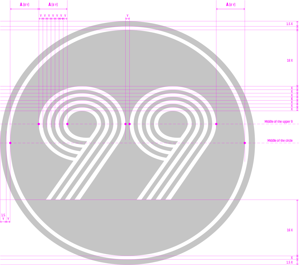
LOGO SIGNAGE GUIDE
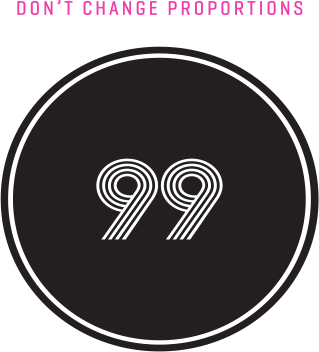
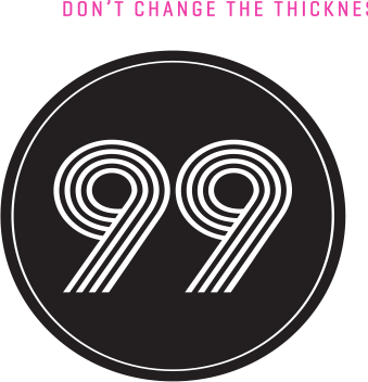
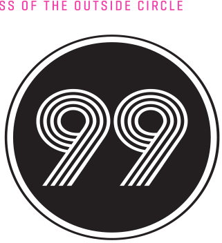
The 99 logo is driven by a number of composition and typography rules, delivering a balanced visual identity. Achieving this does at times require some counterintuitive inputs. Note, for example, that the width of the vertical and horizontal lines are slightly different from one another. Also, the “circle” itself is actually not a perfect circle, with the width of the circle being marginally wider than its height.
The ratios of each element within the logomark have been precisely calculated, and are indicated through X and Y values. These should not be altered.
This standard white logomark version should be used wherever possible. Do note that the logomark is white, not grey. The logomark is displayed in grey only to showcase the specifications as legibly as possible.
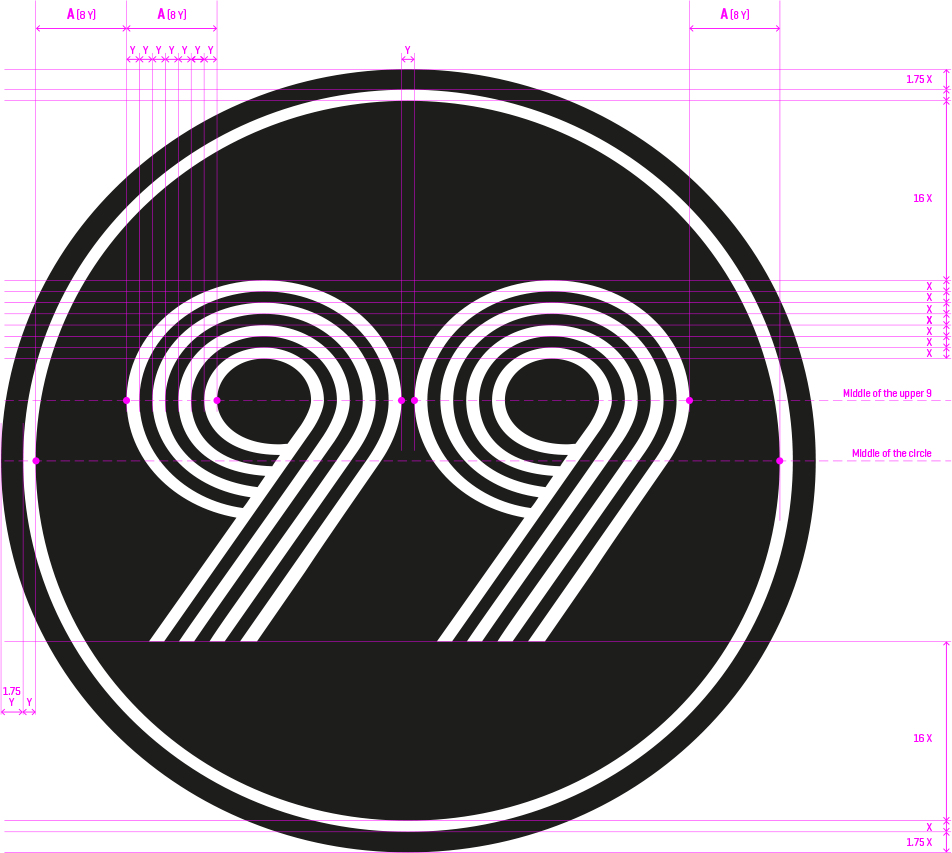
Where a darker logo is needed, this monochrome black version of the logomark on a white background may be used. This black version is laid out slightly differently from the standard version. This is necessary in order to achieve the perception of visual consistency between the standard white logo and its darker alternative.
Follow the steps on this page to achieve the right balance between the two colours, and to ensure the gradient is applied consistently.
pantone 232c
R255 G000 B255
C6 M86 Y0 K0
pantone 137c
R255 G164 B000
C42 M100 Y0 K0
The gradient is applied horizontally from left to right.
The gradient is inclined with an angle value of 25°.


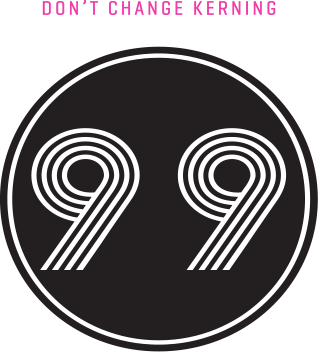
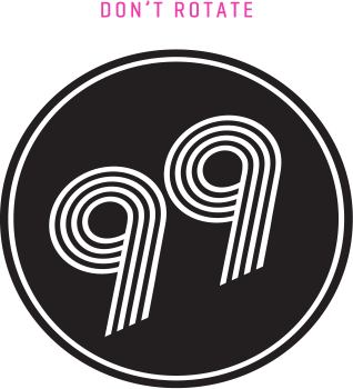
In order to ensure that the 99 brand experience remains consistent, and to maximise brand recognition, the logomark should not be altered in any way.
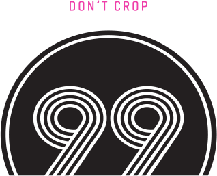
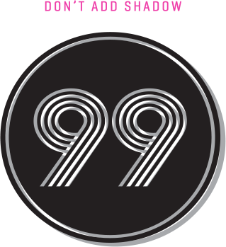
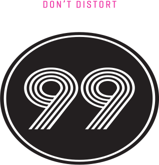
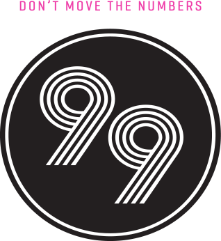
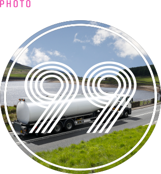
Whether for signage, vehicles, billboards, print and digital advertisements, point of sale, leaflets, or other marketing tools, the typefaces selected for 99 need to be able to make a strong impression, while also maintaining a high level of legibility.
The Rude Slab and Geo Grotesque typeface families are highly versatile, giving 99 the tools to face any communication challenge. To ensure presentation consistency, no other fonts should be used. Showcased here are some of the plethora of available font weights the two typefaces come in.


case study
Industry: real estate
Key visuals: A picture with something to say.
SUMMARY OF PROJECT & CREATIVE CHALLENGE
Transforming Celadon City
from a transactional brand into
an emotional brand.
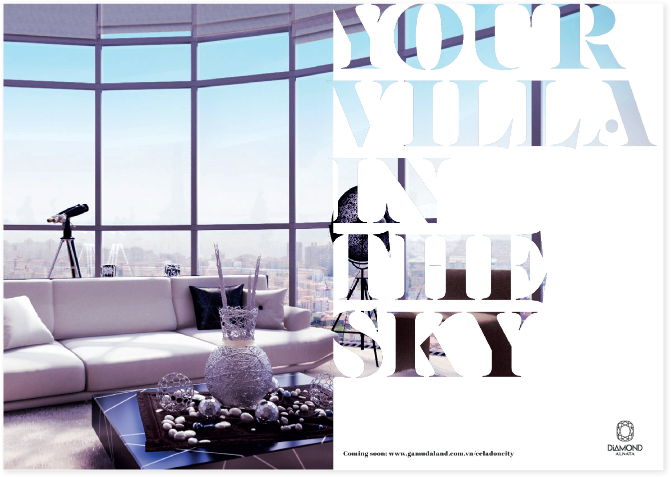
Celadon City is a 200-acre integrated urban area in Ho Chi Minh City, developed by Gamuda Land — the property development arm of Malaysian infrastructure giant, Gamuda Berhad. With construction now starting on Celadon City’s final and most upmarket zone, Diamond Precinct, the developer is eager to raise the project’s profile.
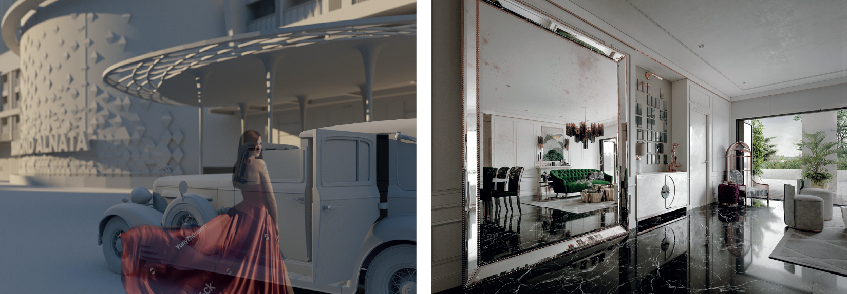
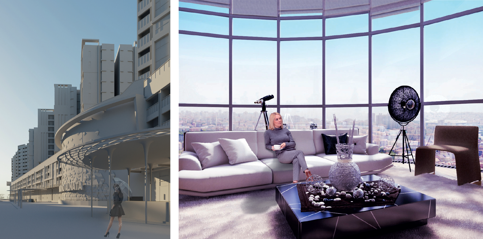
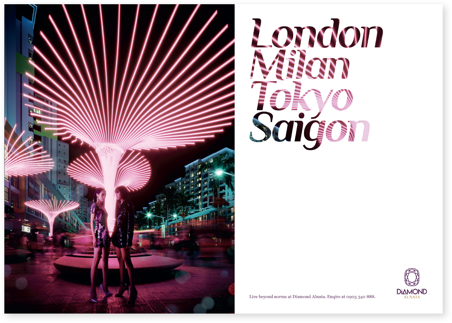
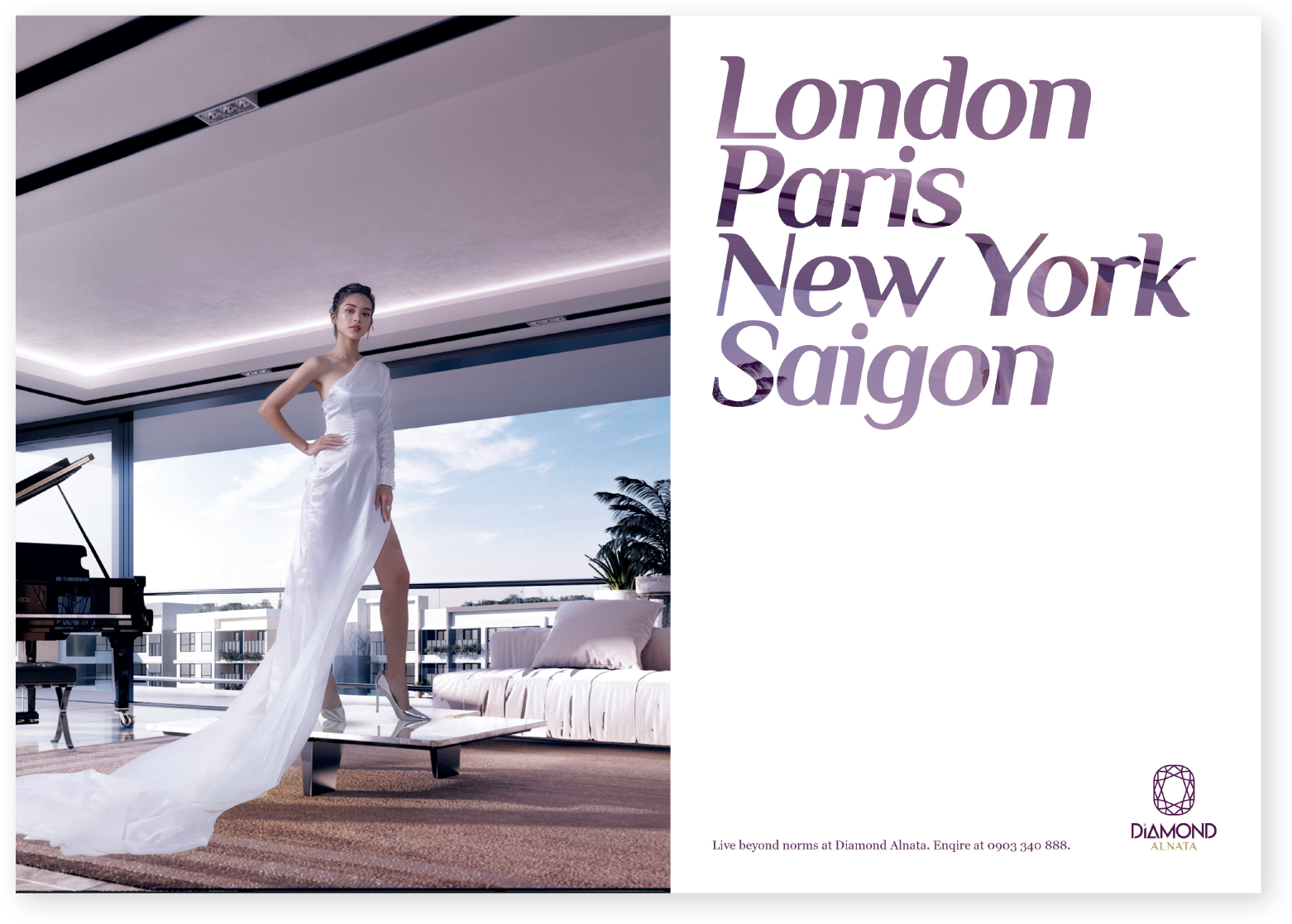
Gamuda Land required two key visuals for their upcoming Diamond Alnata+ marketing campaign. Alnata+ is one of several phases in the release of the Celadon City’s Diamond Precinct. Soyon took the visuals through every stage — from conceptualisation, through to photoshoots, and developing CGI. The client’s only brief was that the key visuals should create a cosmopolitan look and feel.
THE DESTINATION
All of Celadon City’s branding and marketing campaigns to date have presented the project only in purely transactional terms. They’ve outlined features and statistics, foregoing any kind of characterisation or brand storytelling.
In order to effectively reposition the brand within an increasingly competitive market space, Soyon proposed that Celadon City be gradually converted into a more aspirational brand — one able to effectively communicate the project’s intangible markers of quality, develop sustainable differentiation, and take price ceilings to new heights.
As a first step on that road, the key visuals for the Diamond Alnata+ campaign would adopt a people-centric approach, enlivening the brand’s image and adding characterisation.
inspiration
In developing key visual
concepts that carry a
cosmopolitan feeling, we found
inspiration by looking to
current trends in design across
several global
industries.
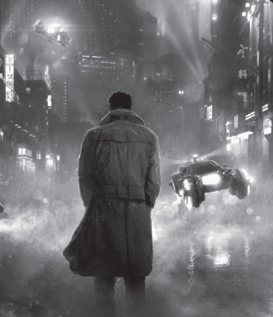

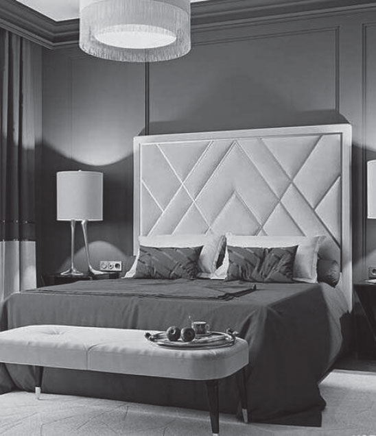
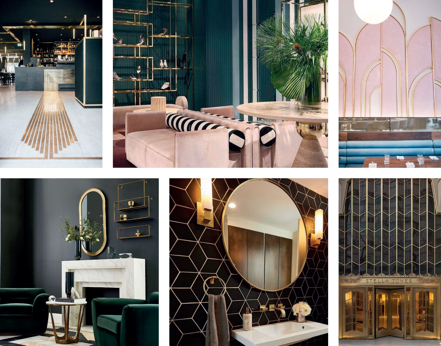
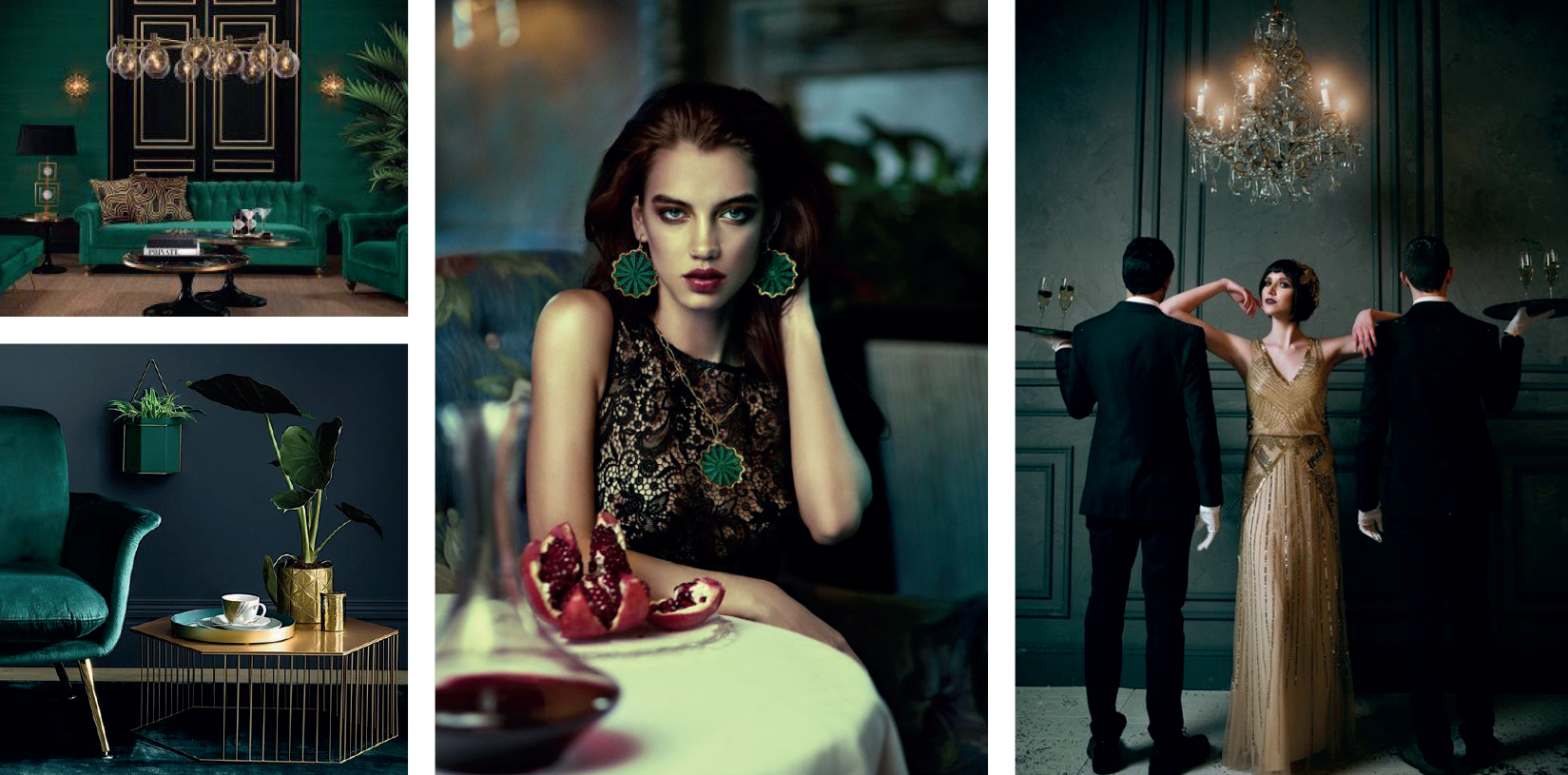
Originating in the 1920s, this trend has seen a recent renewal. The well-defined shapes, colours and materials that are so quintessential to the symmetrical and asymmetrical Art Deco combinations have been revived and reinterpreted in film and in fashion.
The style has also made a particular come-back in interior design. Many furniture designers find inspiration from what was the twentieth century’s most opulent design era. Contrary to how Art Deco was originally expressed, the current trend leans more toward the streamlined and simple. The Art Deco of today is fresh, colourful and playful.
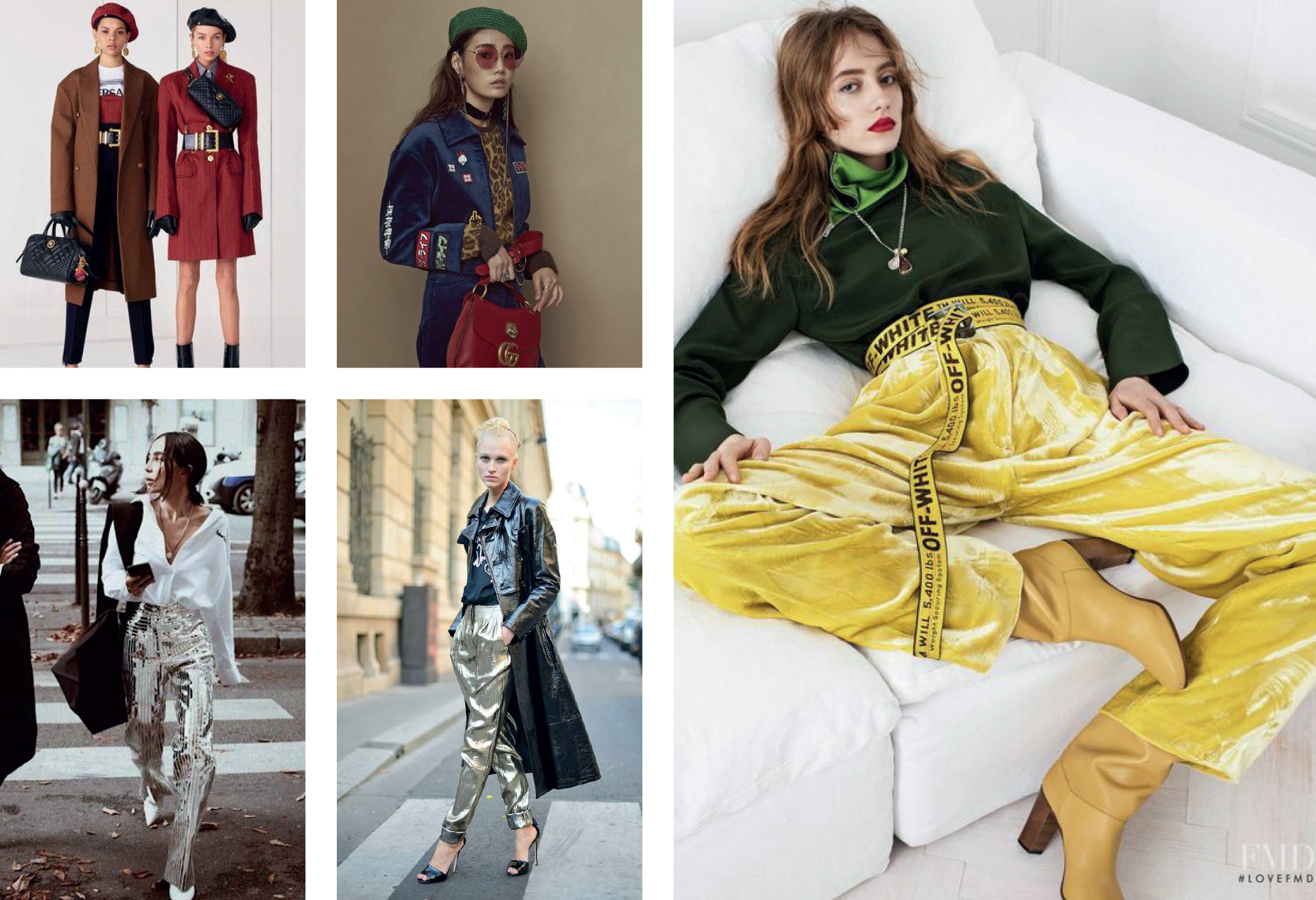
Originally a ‘90s fashion, the velvet trend is back! Starting in 2018, velvet has been seen across the runways — not just in winter but even in spring and summer as well. There have been full velvet dresses, tops, and shoes. This fashion trend took the interior design industry by storm, and so in 2019 we saw the sumptuous, swish and super-soft material making appearances in everything from bedding and covers, to couches, poufs, and many custom furniture pieces.
While traditionally made from silk, with changing times and new technologies, velvet can now be made from just about any fibre. Velvet is back, and it looks like it’s here to stay.

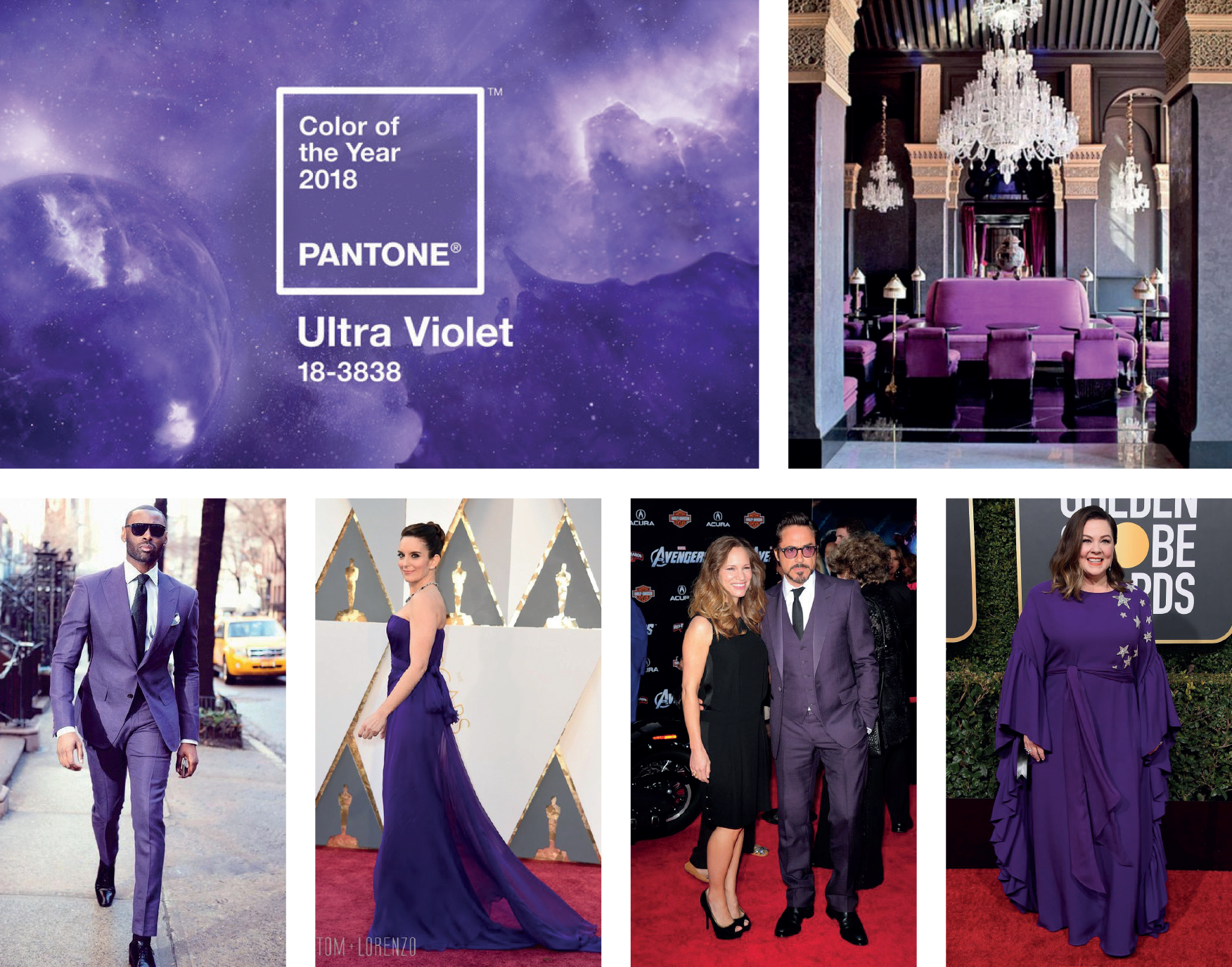
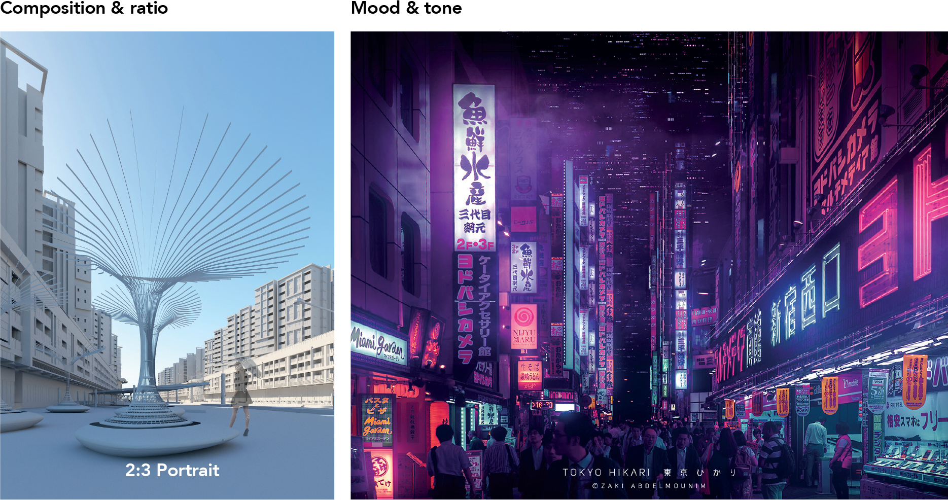
In the early 2010s all anyone could talk about was fifty shades of grey. Now, with the end of the decade here, we’ve got a new star: purple! Pantone 18-3838, or Ultra Violet, was the Pantone colour of the year in 2018, and since then we’ve seen all kinds of shades of purple across every runway and award show.
There’s grape, soft lavender, tyrian purple… The real question is, is purple the new black?
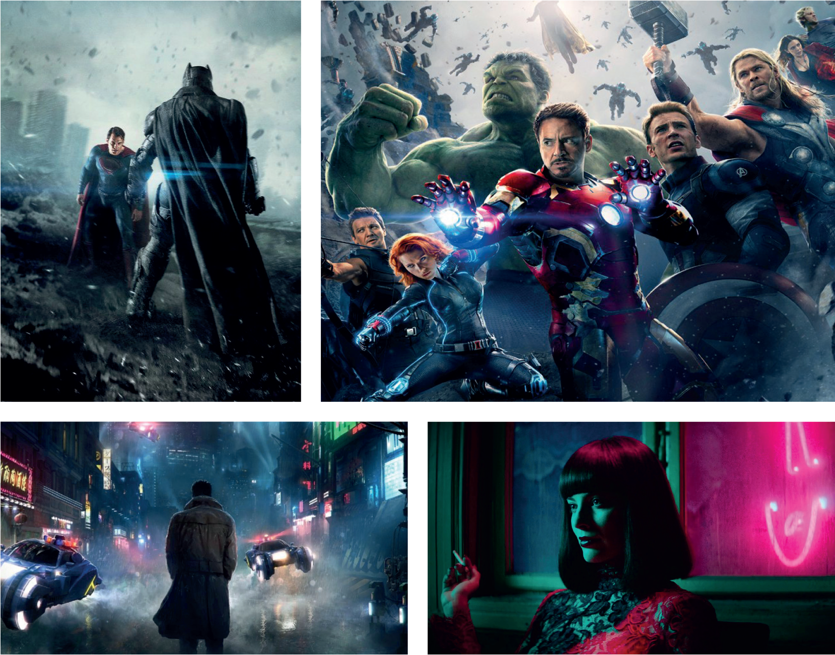
The goodly hero that’s dominated film and literature since the middle of the last century is being eclipsed by the anti-hero. In our modern world of globalisation, global warming, technological advancement, political populism, fake news and dramatization, stories have grown to become more visual, multi-layered, convoluted and visceral.
Think Superman v Batman: Dawn of Justice. The Avengers series. Venom. John Wick. Terminal. Dark and moody certainly reflects today’s tone!
CONCEPTUALISATION
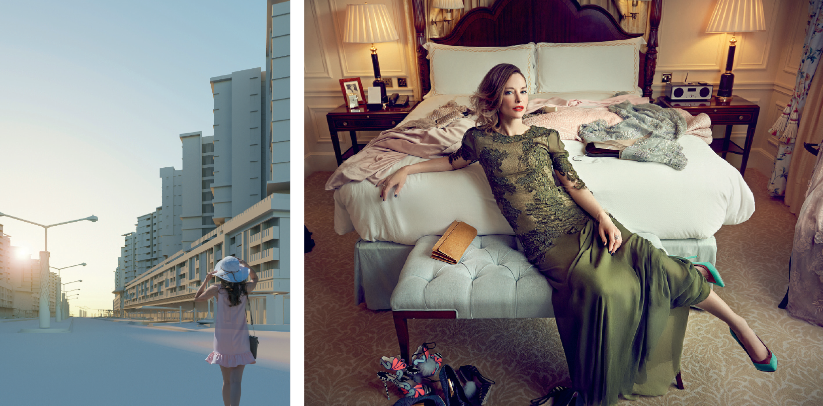
The 1920’s art deco style reinterpreted for a
new twenties — the 2020’s.
Ideal viewing angles
The ultra-stylishness and flair of high fashion.
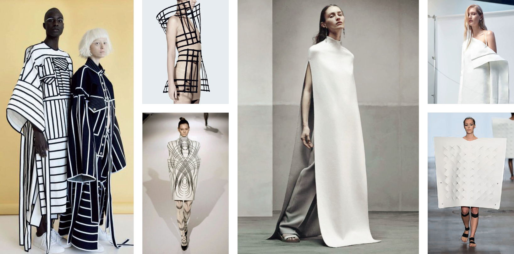
The ultra-stylishness and flair of high fashion.
Ideal viewing angles
A purple colour palette enlivened with the
contrasts of blue skies and vivid light.
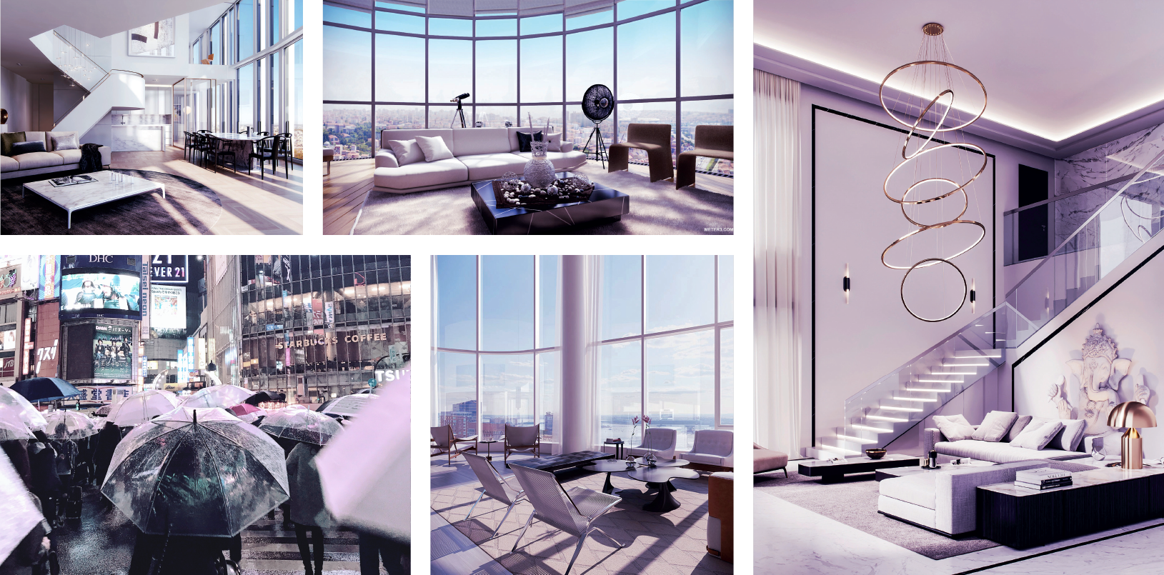
Ideal viewing angles
A futuristic theme full of colours and neon.
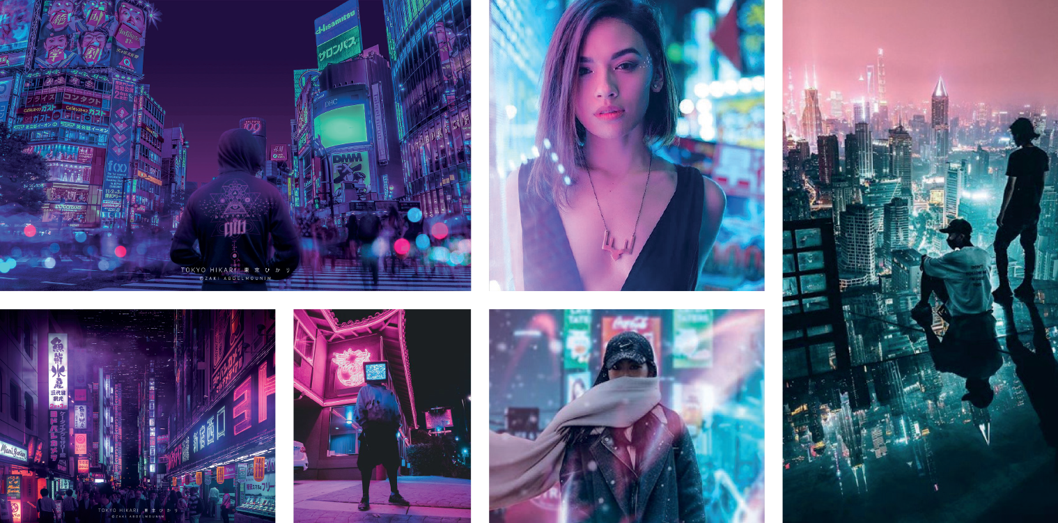
A futuristic theme full of colours and neon.
Ideal viewing angles
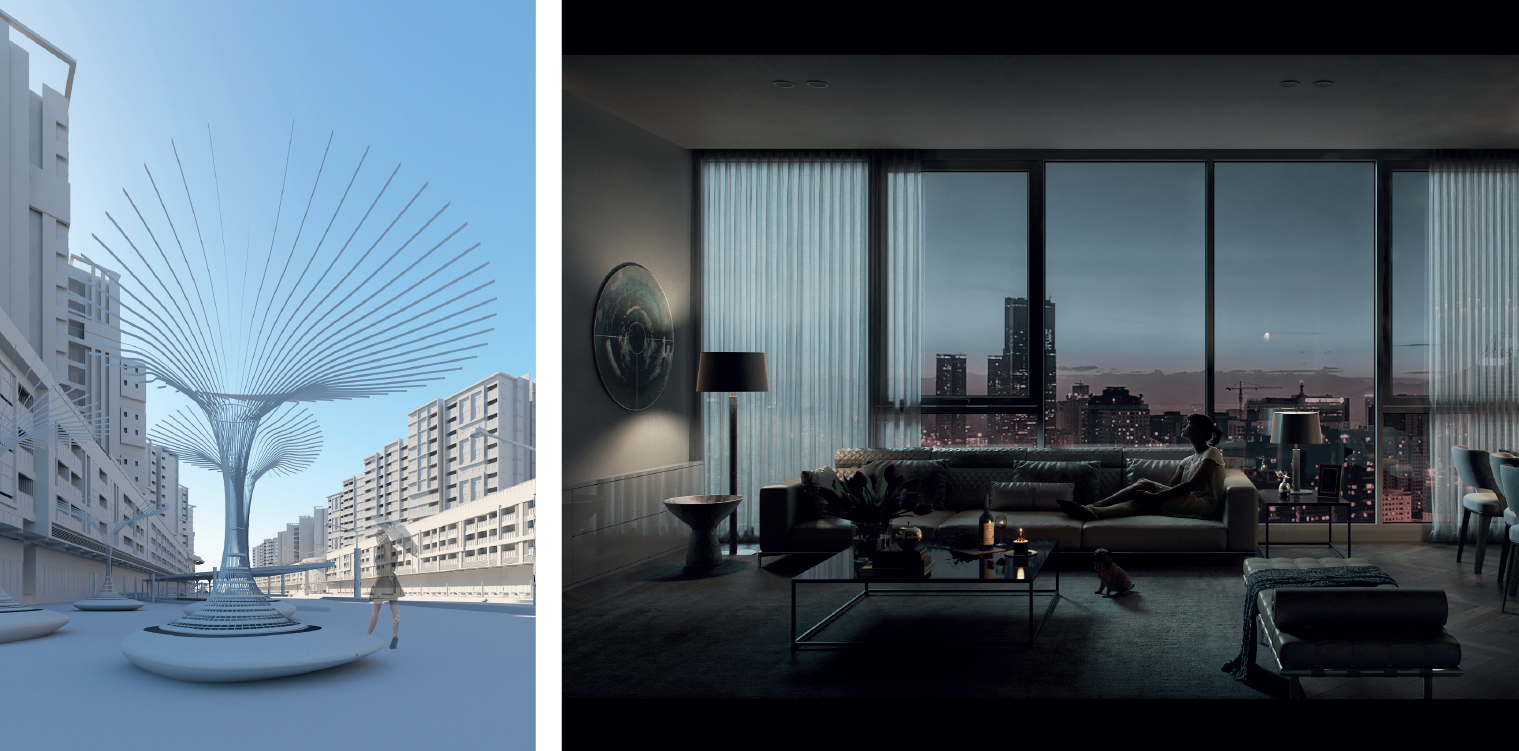
KEY VISUAL #1

(Urbane) fashionable.
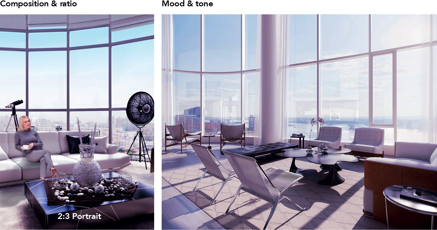
No restrictions, as long as it fits the given mood & tone.
(a) Preferred option: Reflective materials (ideally silver pants, coat or branded shirt).
(b) Alternative option: High fashion look with several layers.
Big toned glasses or sunglasses & clear umbrella (one model).
2-3 big shopping bags (one model).
Other accessories up to stylist.
KEY VISUAL #2

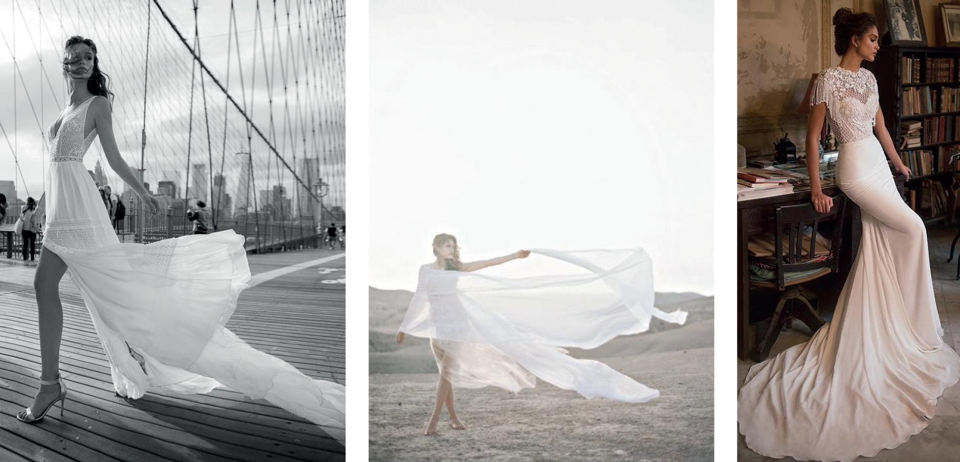
Classic dress.
Ideally lavender or light purple, alternatively white.
(a) Preferred option: Light and flowing in the wind.
(b) Alternative option: Figure-hugging dress with a long train.
Optional. To be proposed by stylist.
Production
case study
Industry: events
Get the gold!
SUMMARY OF PROJECT & CREATIVE CHALLENGE
Politically what?
The Hash House Harriers is an international network of social running clubs, or as they describe themselves — a drinking club with a running problem. With no less than 2,000 chapters, H3 is present on all seven continents. To mark the occasion of the Commonwealth Games coming to Australia, the Gold Coast chapter of the Hashers wanted to host an interhash event, inviting hashers from all over the world to participate.
The Commonwealth Games, drawing nearly 4,500 athletes from across 71 nations and territories, is one of the biggest multi-sports events in the world. An estimated 1.5 billion people watch the games at home on their televisions. The Gold Coast was expected to play host to over half a million spectators during the event, many of whom would be visiting from abroad.
The Gold Coast Hash House Harriers anticipated many hashers among the visitors as well, and so tasked Soyon with developing an event concept able to both attract visiting hashers, and to help make it a hash everyone would certainly remember — no matter how much they had to drink.
From naming to execution, a Hashers event needs to reflect the spirit and character of the Hash House Harriers. Always ready for a laugh, hashers are famed for their off-colour, bawdy, politically incorrect, and often juvenile, sense of humour. Good-natured (and sometimes not so good-natured) ribbing and mockery are part and parcel. Hashers are expected to be able to take a joke, and to be able to give as good as they get.
Brand Identity
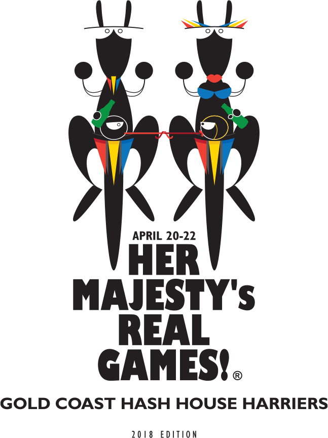
The event contains bad language from the start, and due to its content, shouldn’t be attended by anyone under the age of thirty! The entire communication reflects the Hashers’ penchant for farce and mockery. It makes a joke of the official Commonwealth Games — in fact, the joke starts with the very first brand touchpoint: the name.
“HER MAJESTY’S
REAL GAMES!”
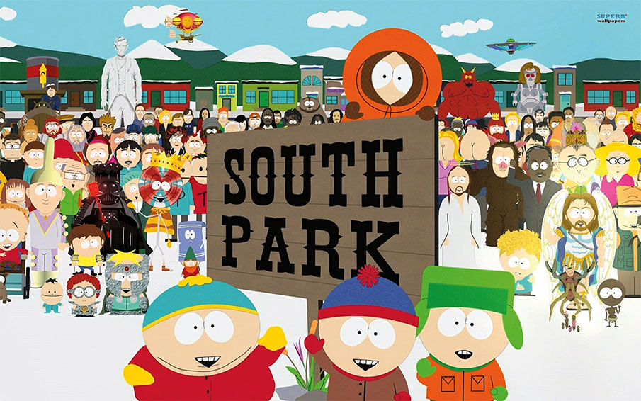
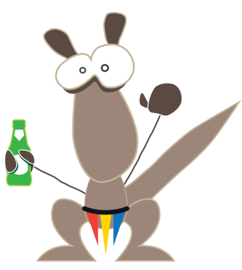
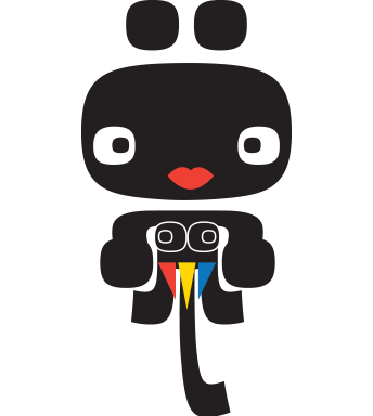
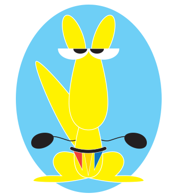
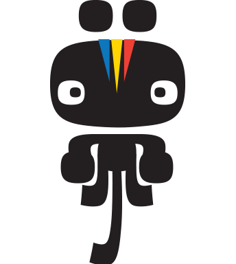
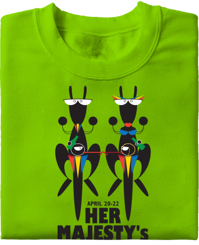
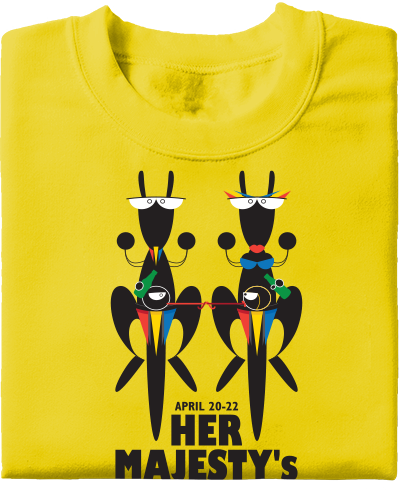
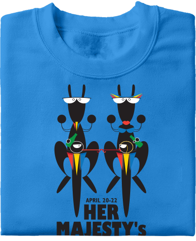
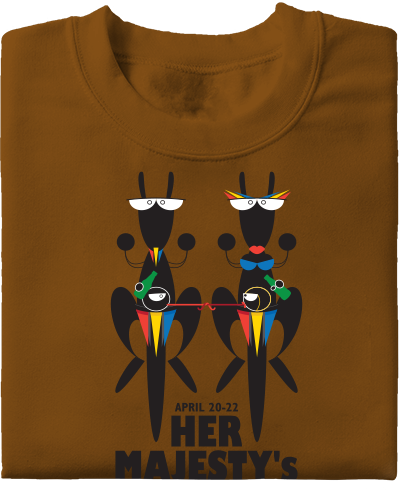
Hashers is branded by South Park-inspired design. Like the Hashers event, though the show seems family friendly, it most definitely isn’t. It’s silly, it’s juvenile, and it’s childish, but no mum in the world would allow their child to watch it! It’s just the same here.
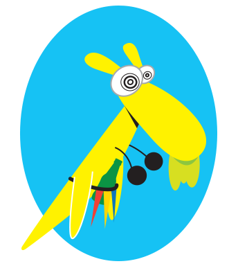
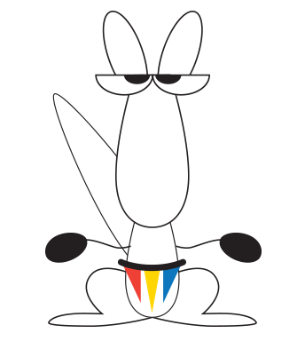
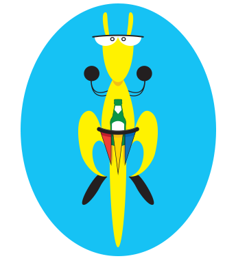
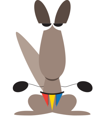
Why cheeky kangaroos? Because no matter what sandgropers, gumsuckers and cabbage patchers may think about it, to the rest of the world kangaroos don’t only make Australia, they are Australia! Well… maybe koalas too, but koalas stink.


BRAND image & tools
Hash events are normally promoted
via websites and EDM. Her Majesty’s
Real Games will have a year-long EDM
campaign, a dedicated website, and team
t-shirts for the participating “athletes”.
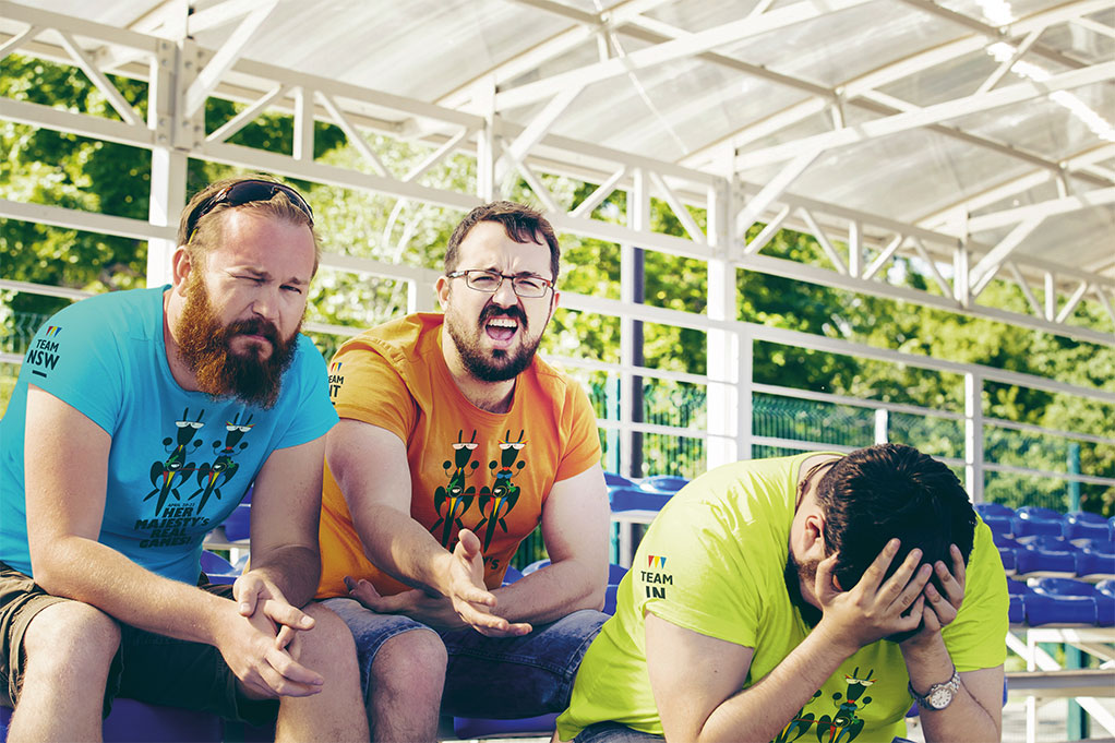
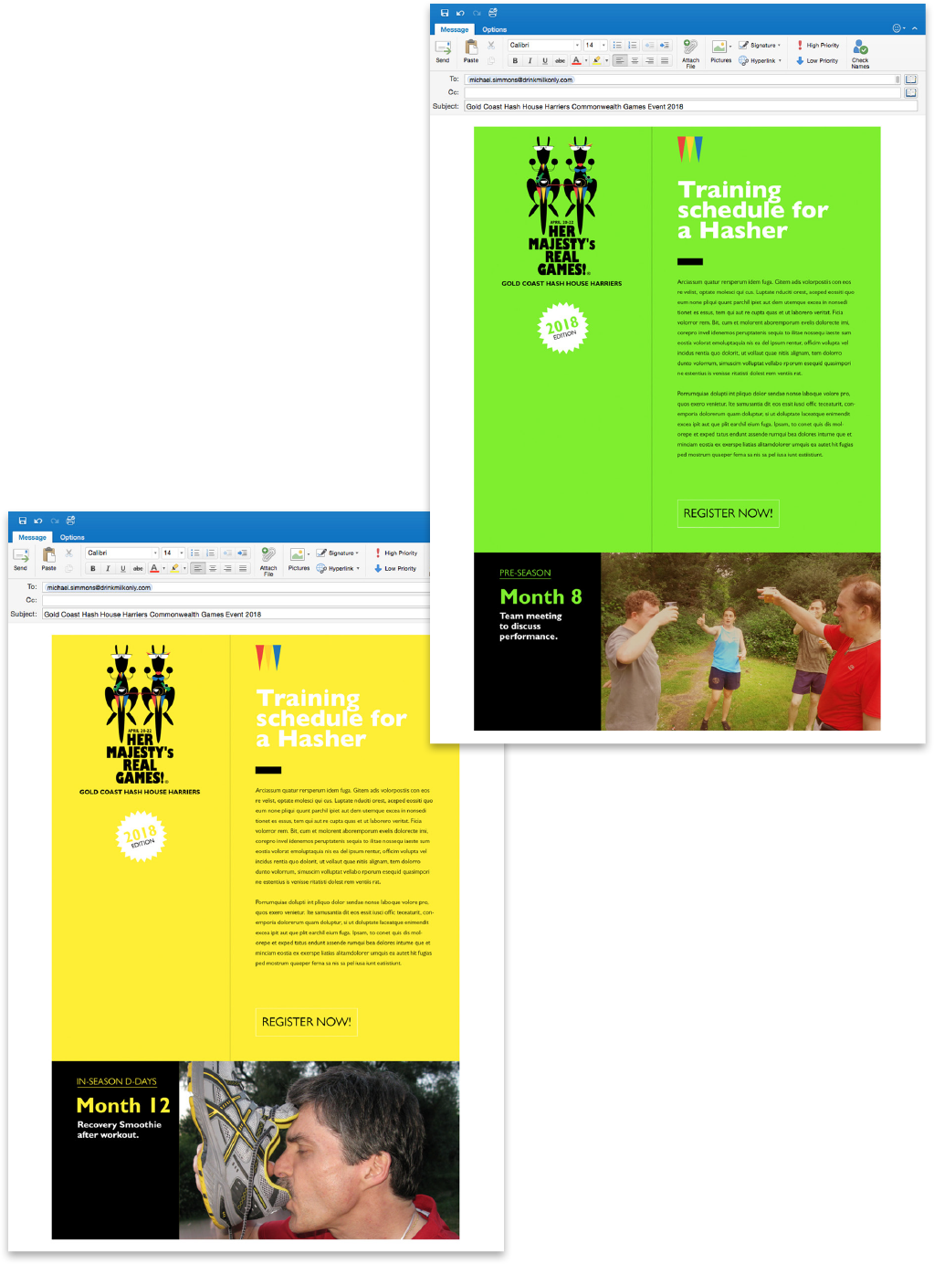
The shirts come in ten colours: One for each of the Australian states and territories in their respective official colour, one for international visitors, and one for staff.
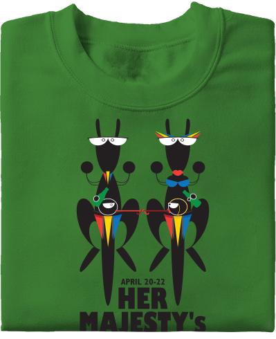
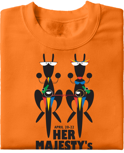
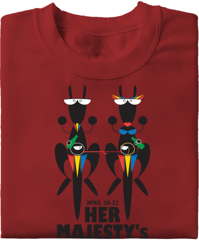
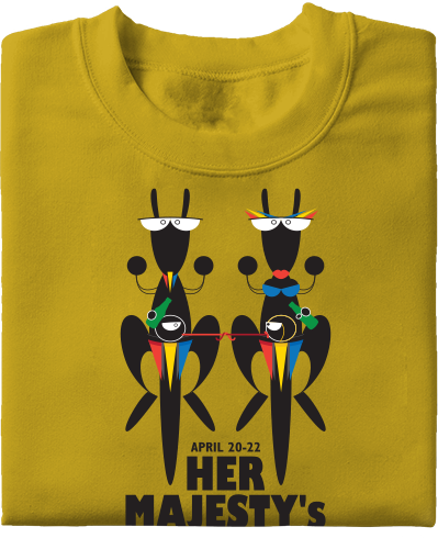
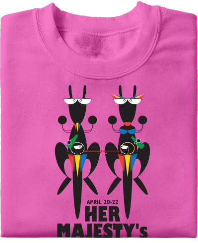
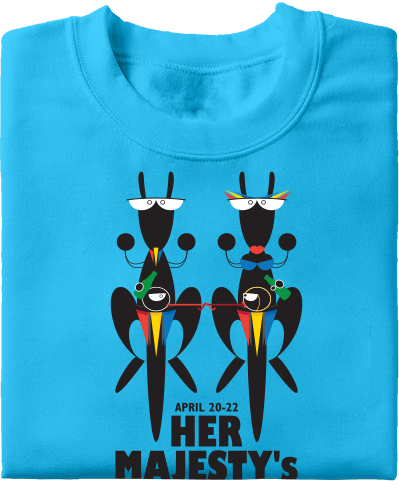
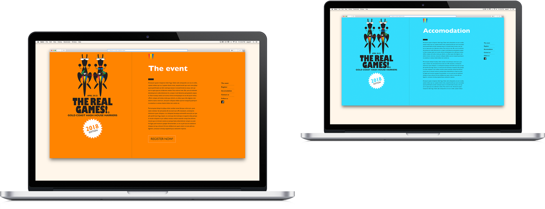
Acting as a supplementary information source, the event website is a simple scrolling page, sharing the t-shirt colour palette. It provides visitors with the means to register and contact the organisers, and offers basic information about the event and nearby accommodation. All updates and news about the event are shared on the event Facebook page.
Hashers receive an EDM every month in the 12 months leading up to the event. Designed to build excitement and anticipation, this teaser campaign is a tongue-in-cheek take on a professional athlete’s training schedule.
